Avatar group
An avatar group displays a number of avatars grouped together in a stack or grid.Neutral selected states
When the platform-dst-tokens-finesse feature flag is enabled, this component uses the new neutral treatment for selected states.
Motion in Early Access
Motion updates for this component are in Early Access and available behind the platform-dst-motion-uplift feature flag.
Usage
Use an avatar group when you want to display a collection of avatars. You can also use them for easy collapse states for a set number of avatars, and with a dropdown to show hidden avatars.
Accessibility
- As the avatar is a visual representation of a person or entity, make sure there’s an alt text equivalent included for screen readers for users, projects, spaces, groups, and repositories.
- Use the
labelprop to describe the list's entity type, for example: if the label isteam membersfor a group of five avatars, the screen reader announcement would be "list team members, five items". - When there is more than one avatar group on the page, make sure to differentiate each group with a unique label.
Behavior
Stack
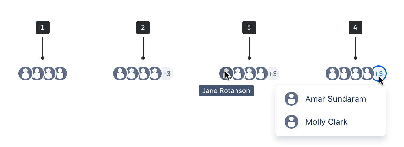
- Avatar group: Stacked groups are limited to five avatars, and should only be used with medium or small avatars.
- Truncated: For groups larger than six, five avatars are displayed. Additional avatars are represented as an avatar with the text +N (where N is the remaining number of avatars above five).
- States: The avatar state will change when a person interacts with it, for example: displaying a tooltip on hover.
- Dropdown menu: When hovering over the truncated avatar, a dropdown menu shows the truncated user names.
Grid
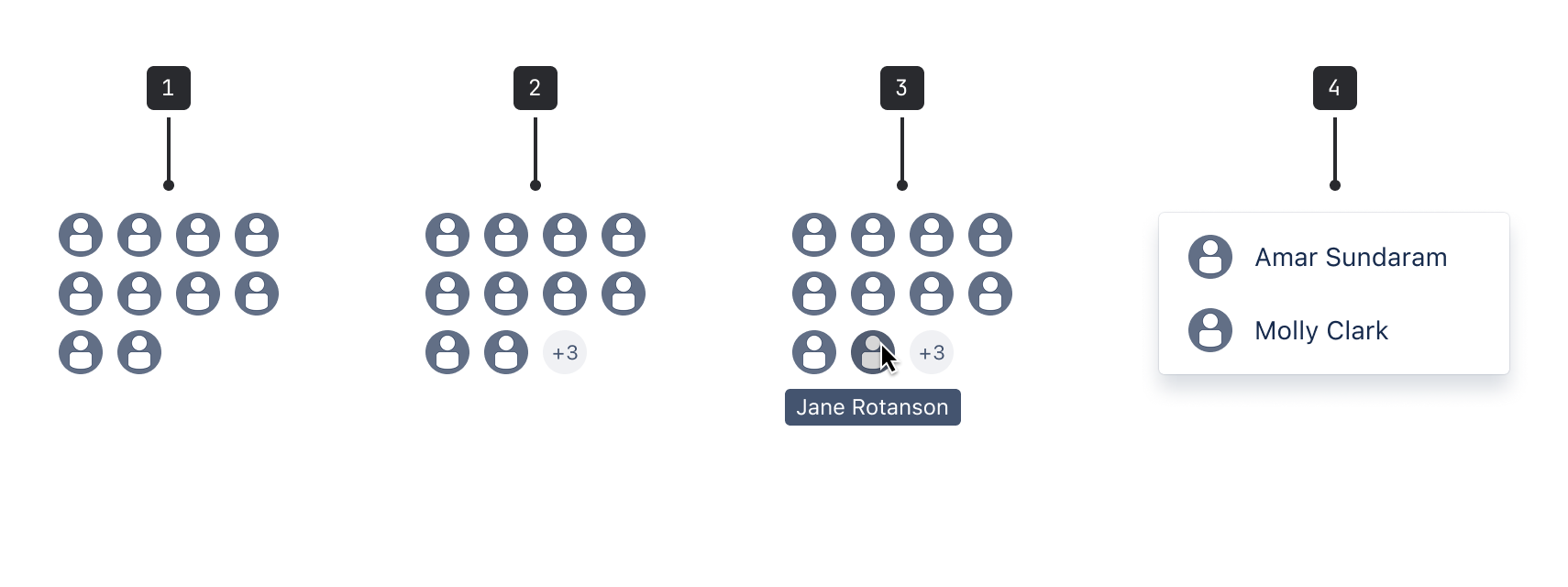
- Avatar group: Grids are limited to three rows.
- Truncated: For groups larger than 12, 11 avatars are displayed. Additional avatars are represented as an avatar with the text +N (where N is the remaining number of avatars above 11).
- States: The avatar state will change when a person interacts with it, for example: displaying a tooltip on hover.
- List menu: All of the avatars are displayed in a list when a person selects the truncated avatar.
- A single avatar forms part of the avatar group.
- Avatar item is the wrapper around each avatar.
- Avatar presence is the status indicator.
- Avatar skeleton shows the loading state.