Color
A signature palette that distinguishes Rovo within the Atlassian brand system.
Brand colors
Rovo uses a combination of Atlassian brand colors to create distinctive, high-contrast moments across AI experiences.
Balance the use of Rovo’s vibrant colors with small doses of black or white which create moments of contrast.

Use Rovo brand colors as clear signals that something is generative, active, or in progress. Brand colors should appear in solid blocks at full intensity when Rovo is active. Never use them as gradients, tints, or decorative fades.
Reserve these colors for Rovo moments so they stay meaningful and don’t compete with standard Atlassian product color usage.
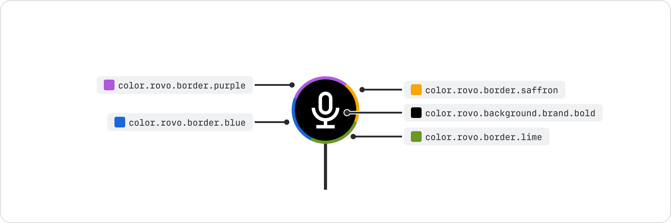
Rovo brand colors most commonly show up in generative states, the Rovo logo, and Rovo spot illustrations. Use the Rovo color tokens and keep them in a clockwise order of blue, purple, saffron and lime.
Do
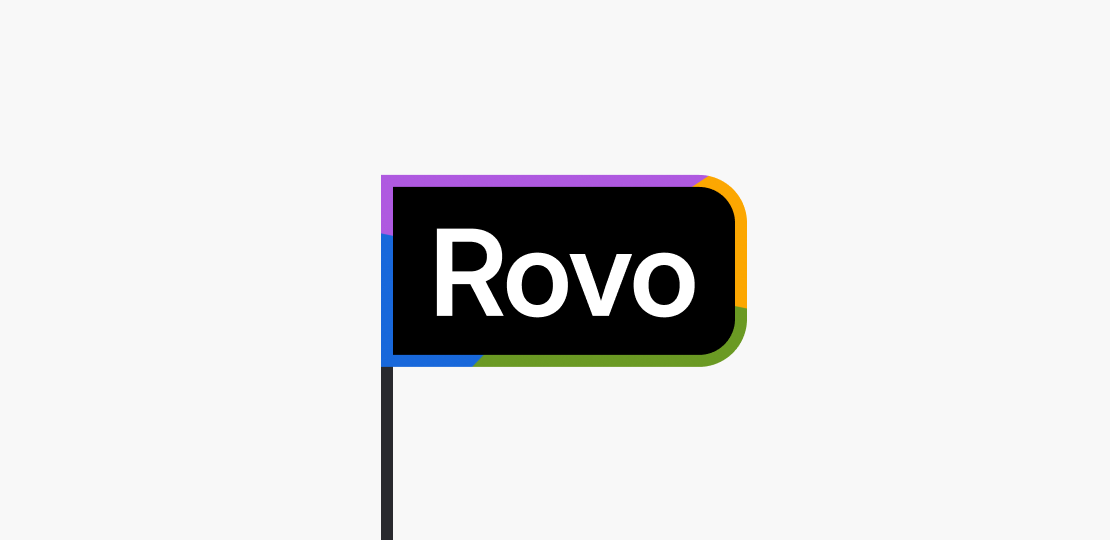
Use flat Rovo colors with hard-edged color stops when using Rovo branded borders.
Don’t
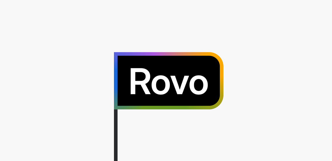
Don’t use blended gradients, blurs or tinted colors when using Rovo branded borders.
Rovo black & white
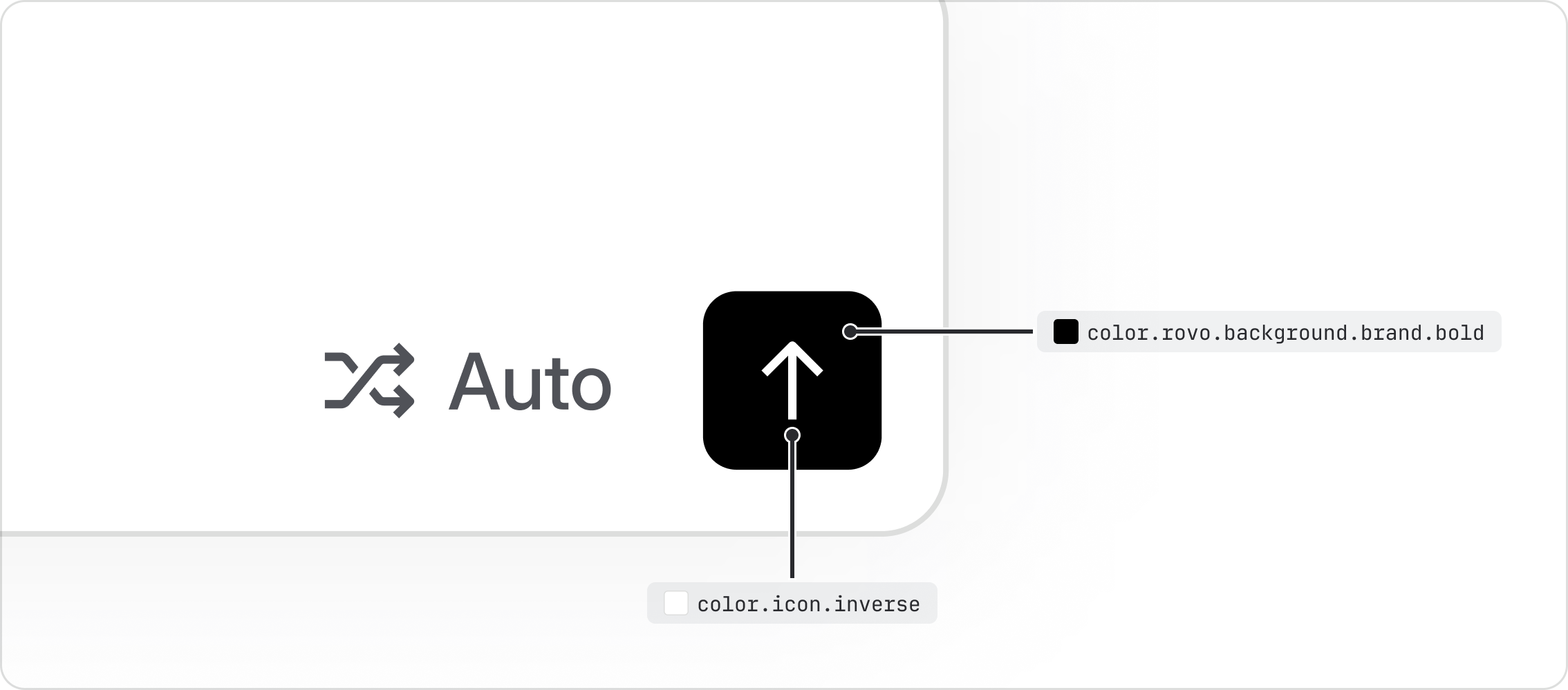
Rovo uses rich black sparingly in light mode, and pure white in dark mode, to visually distinguish
Rovo actions from regular UI. Apply color.rovo.background.brand.bold to Rovo elements such as
primary buttons, cursors and telepointers.
- Read about our color foundations.
- Learn how to use the generative border component.
- Learn how to use spot illustrations.