Use text styles when designing in Figma, and typography tokens and components in code. Use the heading component for heading text, and the text component for body text.
The following table outlines our Figma text styles, their corresponding typography tokens, and suggestions for when and where to apply them.
| Figma text style | Token | Properties | Suitable for |
|---|---|---|---|
| Heading | |||
| H900 | font.heading.xxlarge | Brand and marketing content. | |
| H800 | font.heading.xlarge | ||
| H700 | font.heading.large | Product page titles such as forms. | |
| H600 | font.heading.medium | Headers in large components, such as modal dialogs. | |
| H500 | font.heading.small | Headers in small components where space is limited, such as flags. | |
| H400 | font.heading.xsmall | ||
| H200 | font.heading.xxsmall | Headers in fine print or tight spaces. Use sparingly. | |
| Paragraph | |||
| ^ | font.body.large | font.weight.regular | Long-form content such as blogs.The default size for reading text in long paragraphs. |
| ^ | font.body.large | font.weight.medium | |
| ^ | font.body.large | font.weight.bold | |
| UI Text | font.body | font.weight.regular | Short text, such as descriptions in flags, or labels in buttons.The default size for text in components, and short content. |
| Default | font.body | font.weight.regular | |
| ^ | font.body | font.weight.medium | |
| ^ | font.body | font.weight.bold | |
| Small | font.body.small | font.weight.regular | Secondary level content such as fine print or semantic messaging.Use sparingly. |
| ^ | font.body.small | font.weight.medium | |
| ^ | font.body.small | font.weight.bold | |
| Code | |||
| Code | font.code | For use in code block only. | |
^ Figma text styles coming soon in a future release.
Follow these guidelines when using tokens and text styles, to create a seamless and consistent user experience across platform experiences.
Use the Atlassian space tokens and color tokens in conjunction with typography to align to the design foundations.
Typography tokens and components have been designed with accessibility considerations. Some people need to read text on different screen sizes or at different magnification levels. Coding your typographic experiences correctly helps assistive technology interpret the structure of your content.
To ensure product experiences are accessible for all our users, ensure you do the following:
Accommodate people who use assistive technologies and their reading preferences with responsive text, typography tokens use relative values (rem) to determine font size on different browser default sizes.
Use text styles (in Figma) and typography tokens and components (in code) to ensure a legible font family, font size and visual hierarchy between text styles.
Use text color tokens to achieve minimum color contrast for legibility.
Apply correct HTML tag hierarchy, to ensure assistive technologies interpret your experiences correctly.
Follow established experience patterns for interactions using text.
The general guidance for comfortable reading is to use a minimum font size of 16px for long-form text such as blogs. The smallest font size available in the Atlassian Design System typography tokens is 12px, avoid using except for fine print.
Visit our accessibility documentation to understand more about accessible design.
Use headings for page titles and subheadings to introduce content. They help readers scan and understand the structure of content.
Do
Write succinct and clear headings to summarise content on a page or section.

Don’t
Don’t write overly long titles. Use shorter titles that can be viewed easily on all screen sizes.
Do
Use large headings to draw attention to content.
Don’t
Don’t use heading sizes smaller than the body font size. Use headings equal or less than twice the body font size.

Do
Clearly differentiate heading sizes to create hierarchy.

Don’t
Don’t use similar heading sizes for different heading levels. Use between 2-4 heading size difference between levels.
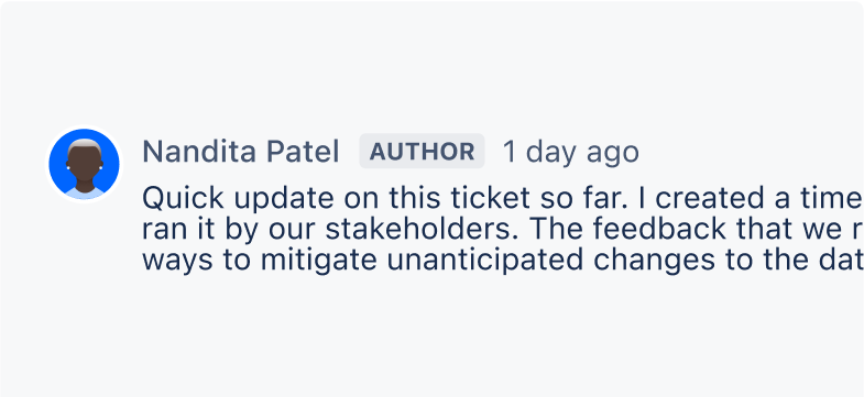
Use body text for the main content. You can use body text after headings or subheadings, for example as detailed descriptions and messages, but it may also be used as standalone text in components.
In Figma, paragraph spacing is set for body text styles only. To represent paragraphs in code, use separate text components for each paragraph and manage paragraph spacing with the stack component.
Do
Use body text for paragraphs of text such as descriptions or blogs.
Don’t
Don’t use body text for headings. That’s what headings are for!
Do
Use body text in components such as buttons, inputs, lozenges and menus.
Don’t
Don’t use heading text in components, instead use body text with a heavier font weight to create greater contrast.
Do
Use the text styles and typography tokens. Body text has optimized line height for reading comfortably.
Don’t
Don’t adjust line heights to fit text, cramped text is more difficult to read.
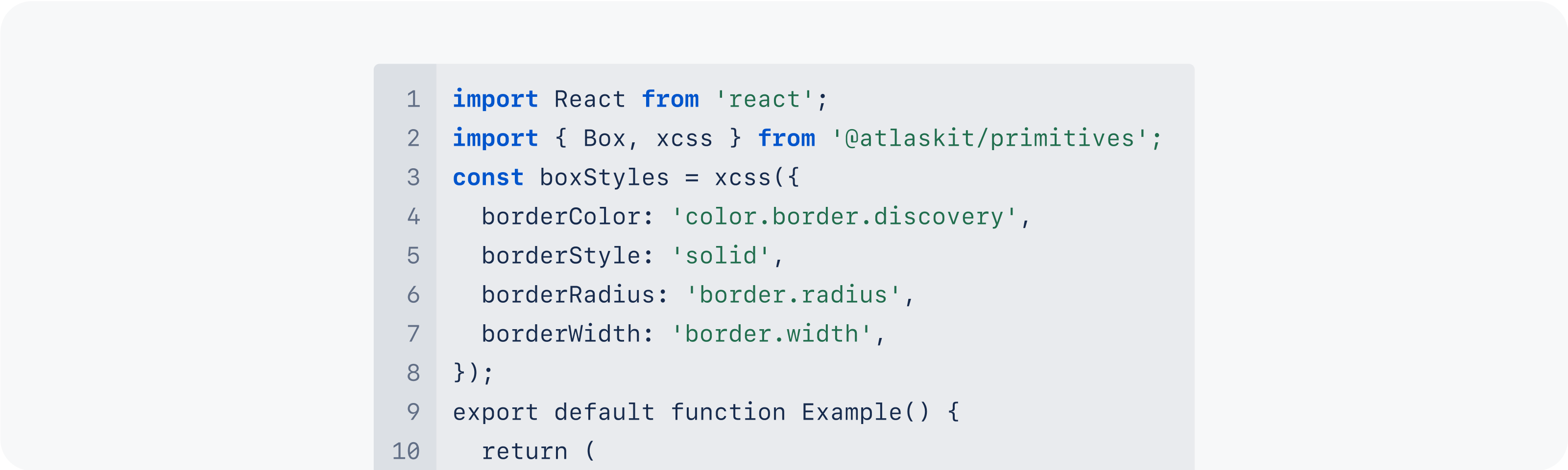
Use code text to represent code only, either inline or in code blocks.
There are four font weights available in our system: regular, medium, semibold and bold. We selected these based on our fallback fonts to minimise the visual differences across operating systems.
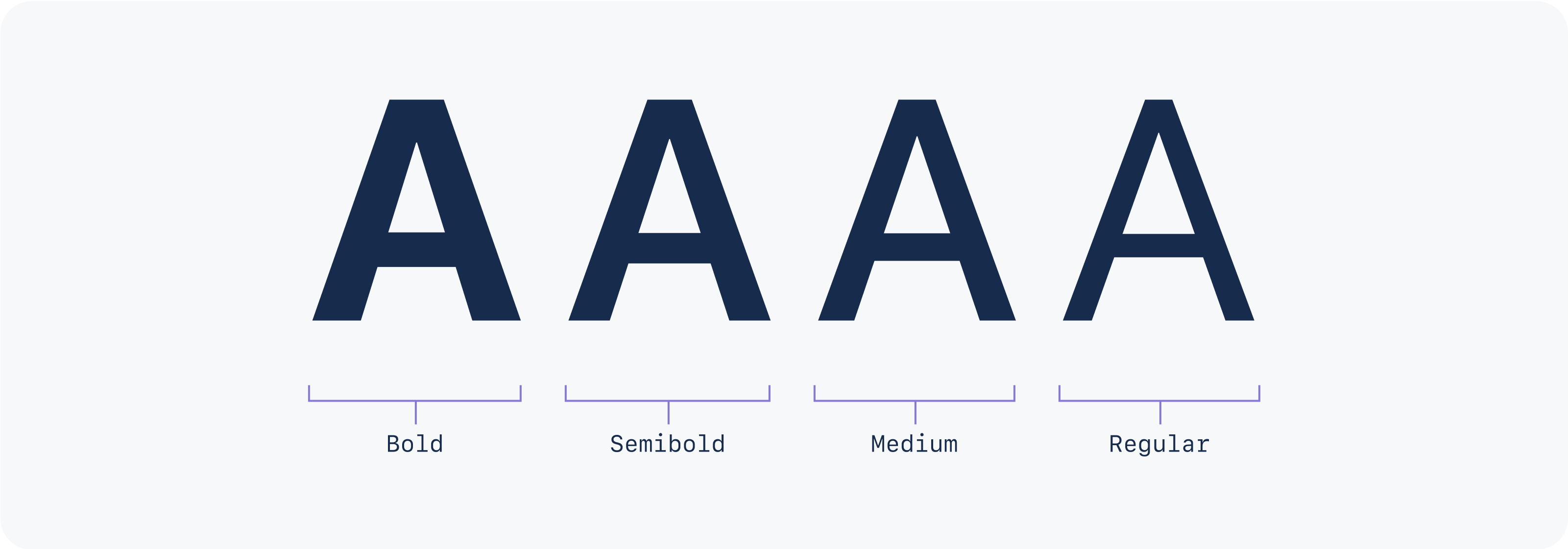
We recommend using the following default weights for our text styles:
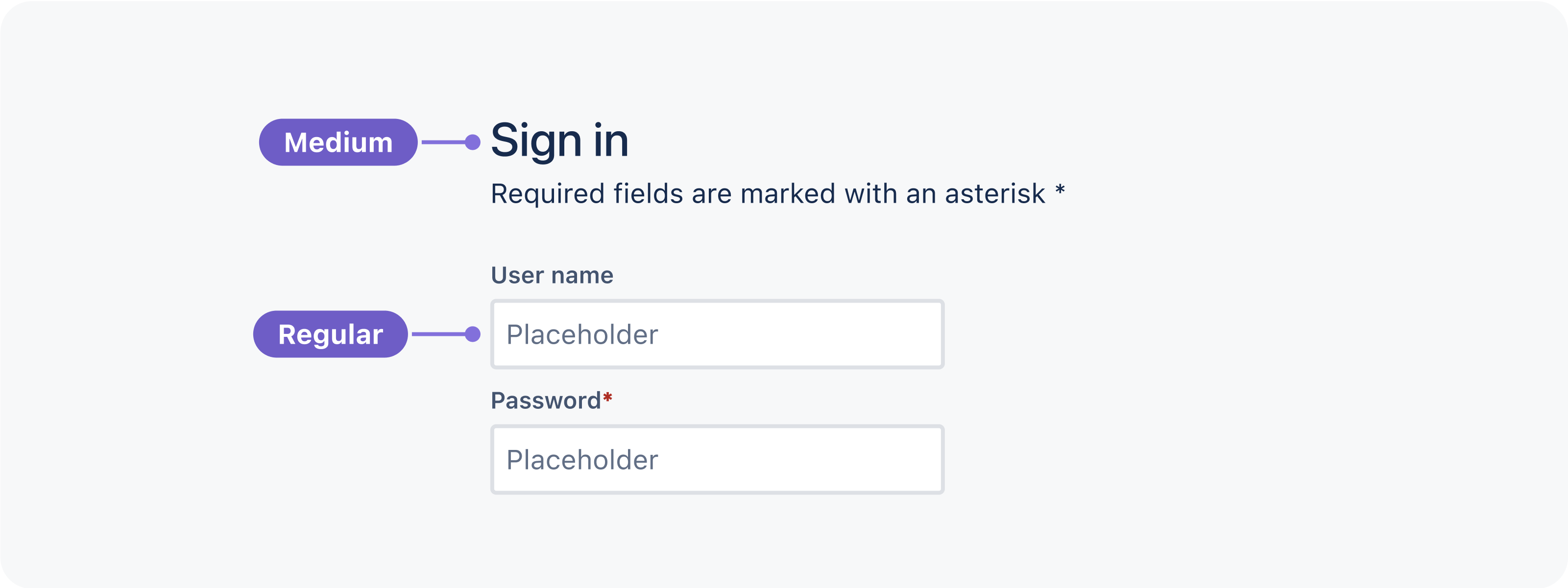
Body in regular weight for paragraphs.
Body in medium weight for use in components and alongside icons.
Body in bold weight should be used in unique cases where text needs to be differentiated or given more emphasis. Use this weight sparingly.
Semibold weight is also available but use this weight with caution. Our fallback fonts don’t support this weight and will default to bold.
Use color.link tokens for inline links and see link button for guidance on this button variant.
Do
Use design tokens to follow inline link styling and provide visual clues to identify links in static text.
Don’t
Don’t show inline links in the same colour as surrounding text or ignore styling patterns for interactive text.
Never truncate text.
If you do use truncated text, for example if you are displaying user generated content of an unknown length, make sure that there's another option for people to expand and read the text.
Do
Display content using the maximum character count allowed within components, especially if it is important information.
Don’t
Don’t truncate content, if you must truncate make sure there is an option for people to expand and read the full text.
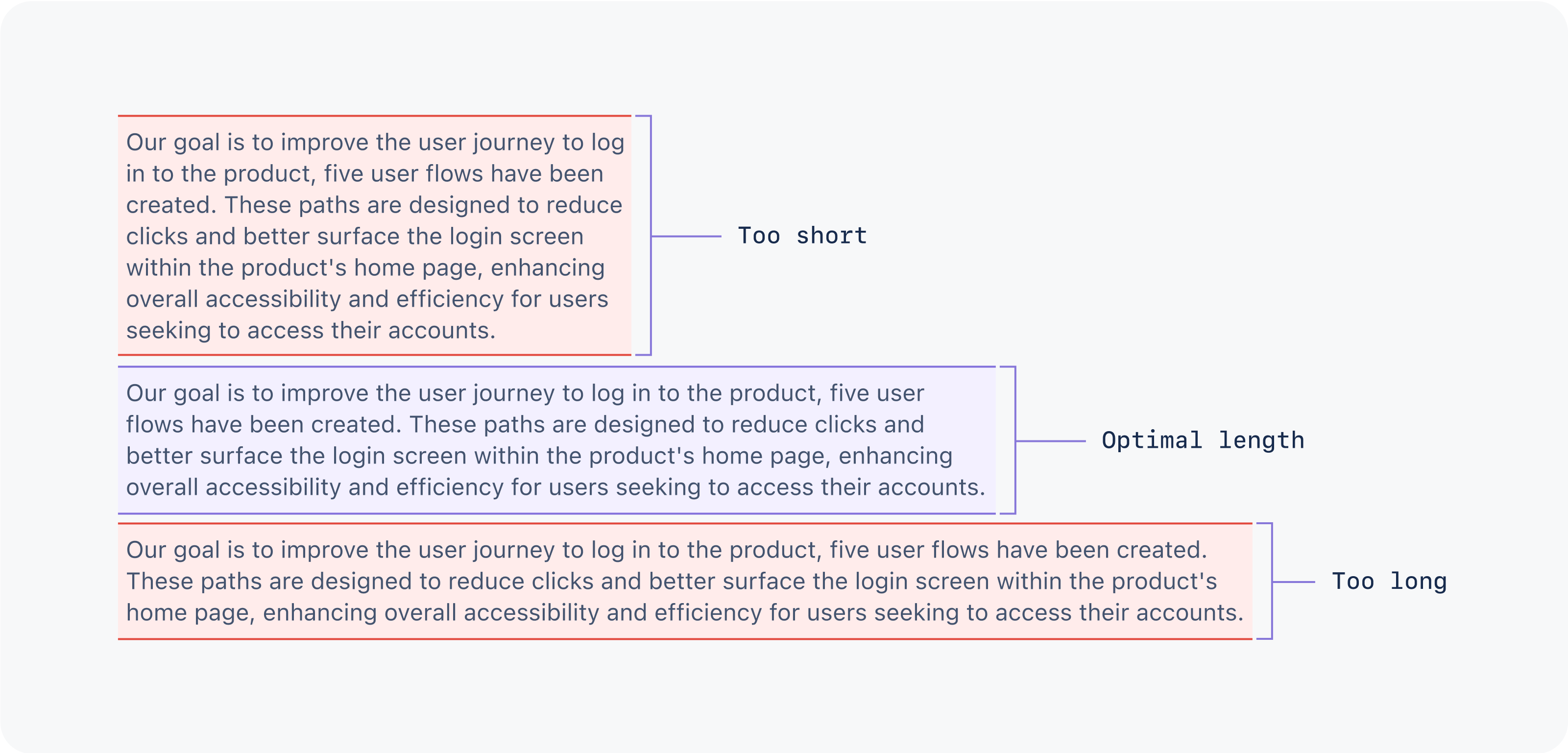
Wide lines of body text are difficult to read. Readers may choose a wide layout but it’s good practice to design for the ideal line length.
For the English language, optimal line length is between 60 and 80 characters per line including spacing, or approximately 10-12 words.
This can vary based on font, font size and how it will be displayed. For example, line lengths need to be shorter when reading text on smaller devices.
Creating hierarchy means using different font weights and sizes to let people easily see what content is the most important.
Our typography system allows visual hierarchy to be achieved in multiple ways. Using some or all of the below suggestions are ways to create extra levels of meaning and hierarchy to your work.
Use text styles and font weights to draw attention to titles and important content.
Use text size and color to differentiate between primary and secondary level content.
Read more about writing style and content guidelines in our content documentation.
The Atlassian Design System’s focus is product UI, however our service sites use a mixture of both marketing and product typography. The appropriate typography can be assessed on a case-by-case basis depending on the following considerations:
Atlassian messaging vs. user-generated or modified content
editorial content vs. technical content
brand marketing visual styles vs. product UI visual styles
consistency across sites vs. one-off solutions
Please work directly with the Creative & Design teams when assessing typography for these types of properties.
Visit Atlassian Brand documentation for more assets and guidance (authenticated users only).
Atlassian relies on several third-party services to provide content and information to Atlassian employees, partners, and sometimes, users. Most information in most third-party portals and services should maintain their native styling.
This means that we should not override most of the default elements, styles or layouts. However, there are several Atlassian brand assets that can be used to imply authorship, endorsement, or affiliation with a given service.
For all new features, we recommend using Atlassian Design System and other Atlaskit components. For existing code, you can continue to use Atlassian User Interface (AUI).
Was this page helpful?
We use this feedback to improve our documentation.