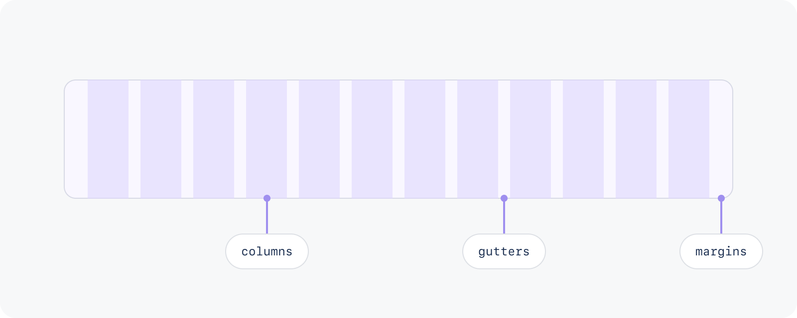
The layout grid structure has three elements:
Columns divide the page into equal vertical sections, and are used to organise content.
Gutters are the gaps between the columns, and separate content in a consistent way.
Margins define the outer edges of the grid, and prevent content from spilling out over the viewable regions.
This grid documentation is for design only. Engineering should refer to the page layout component.
There are two types of grid: fluid and fixed. Both grid types use breakpoints to determine whether the layout needs to change between viewport sizes.
More guidance for applying grid in your designs.
The fluid grid stretches across the screen to fill all available space in the main content area. This means the columns and the content placed within them scale and resize to fill the available space.
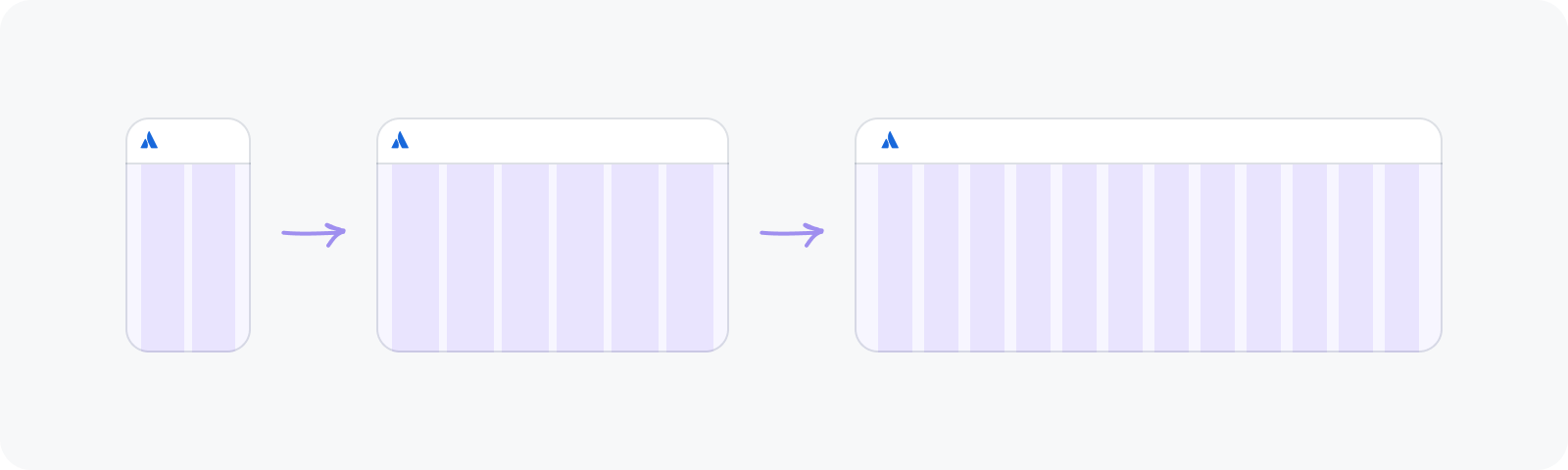
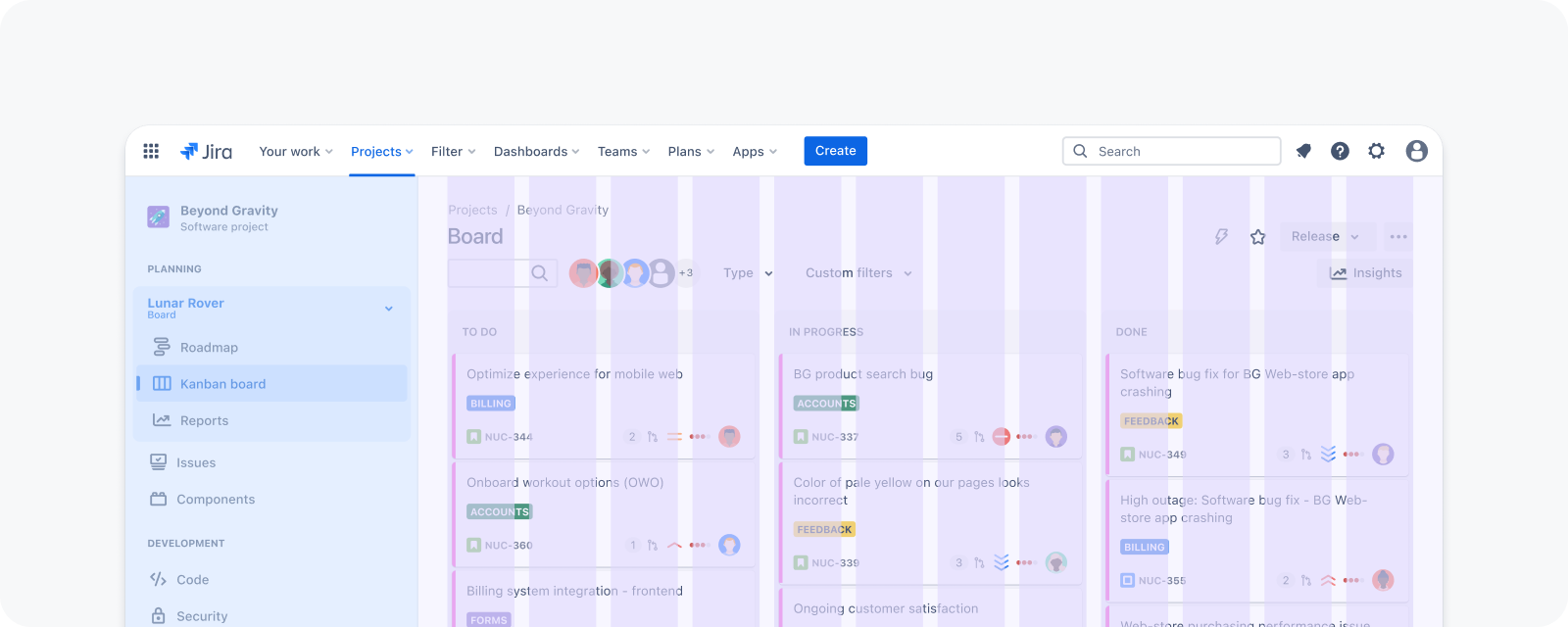
They are best used for information-dense pages, such as kanban boards, to maximise screen real estate. Here’s how a fluid grid is applied in Jira:
The fixed grid applies the ideal maximum width to page containers according to the elements being displayed. There is both a fixed-narrow and fixed-wide grid, so content can be displayed using the most appropriate width.
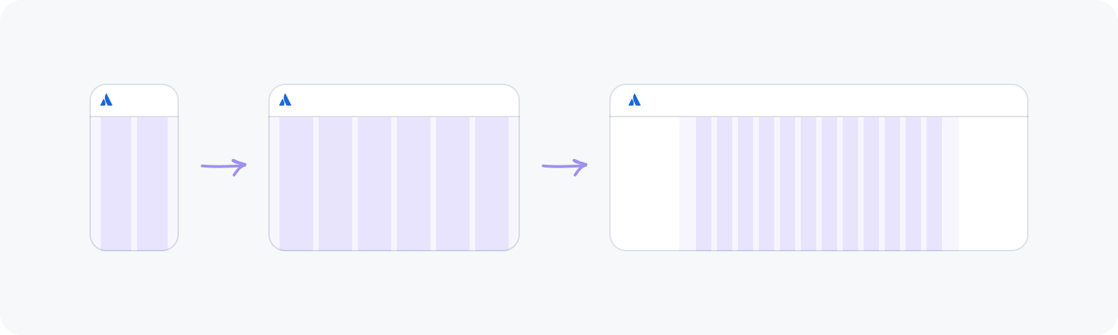
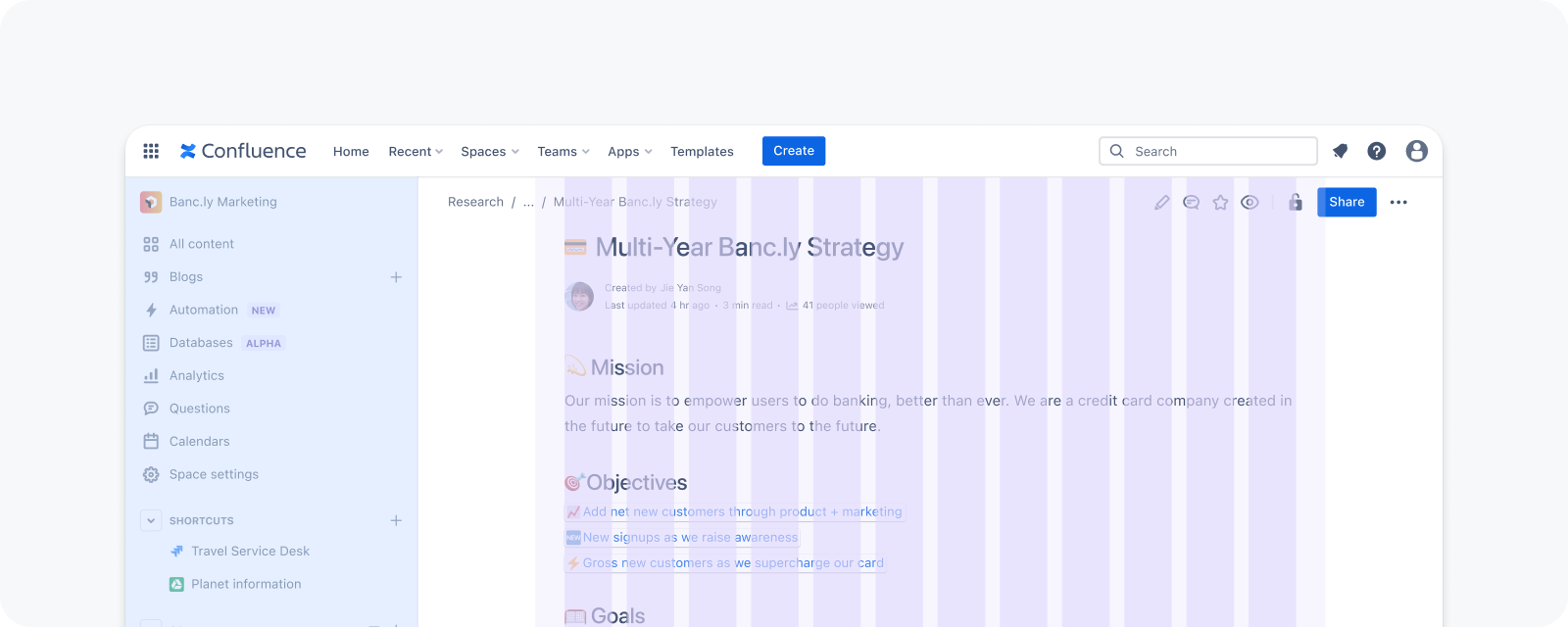
Fixed-narrow grids are best used for content-focused pages, such as blogs and articles, to limit line length and improve readability. Some internal elements, such as headers, may break out of the grid to span across the page. Here’s how a fixed-narrow grid is applied in Confluence:
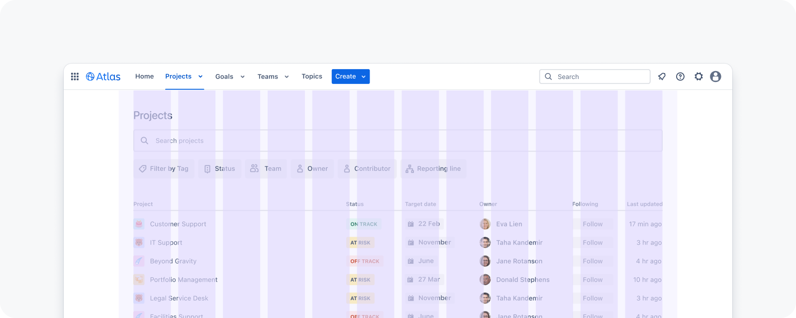
Fixed-wide grids are best used for content-dense pages, such as data tables, to balance screen real estate and readability. Internal table columns do not need to align to the grid. Here’s how a fixed-wide grid is applied in Atlas:
Each breakpoint is the threshold at which the website’s layout changes, to ensure optimal user experience. In responsive design, a breakpoint range determines the most appropriate number of columns for that viewport size, plus recommended widths for margins and gutters.
Our grid aligns to the 6 Atlassian Design System breakpoints:
| Breakpoint | Viewport | Columns | Gutters | Margins |
|---|---|---|---|---|
xxs | 320 - 479px | 2 | 12px | 16px |
xs | 480 - 767px | 6 | 12px | 16px |
s | 768 - 1023px | 6 | 12px | 16px |
m | 1024 - 1439px | 12 | 16px | 32px |
l | 1440 - 1767px | 12 | 16px | 32px |
xl | 1768+px | 12 | 16px | 32px |
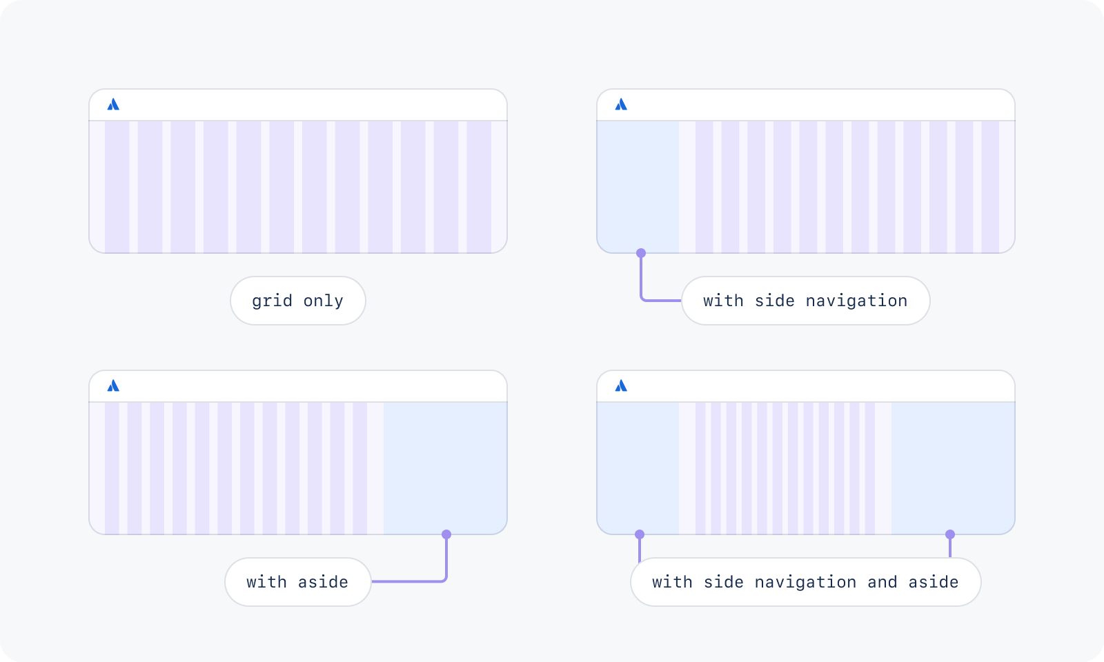
Our grid has 12 columns for aligning content. Content should span across 3 or more columns, up to a maximum of 12. For flexibility, mix and match the number of columns used to unlock a variety of layouts across different breakpoints.
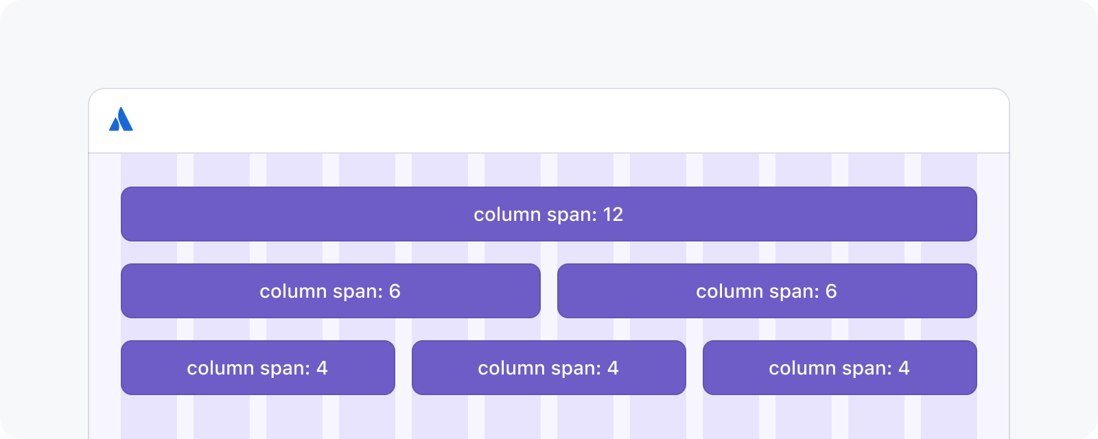
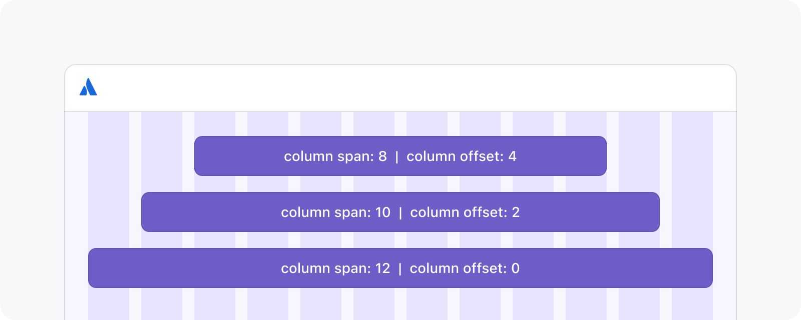
Content does not need to span across all 12 columns. It can span a smaller set of columns, resulting in a layout with content centered on a 12 column grid.
Layout regions are the building blocks for any web page. They are composed of elements and components that share similar functions. Atlassian’s layout grid starts below the top navigation, and provides structure to the main content.
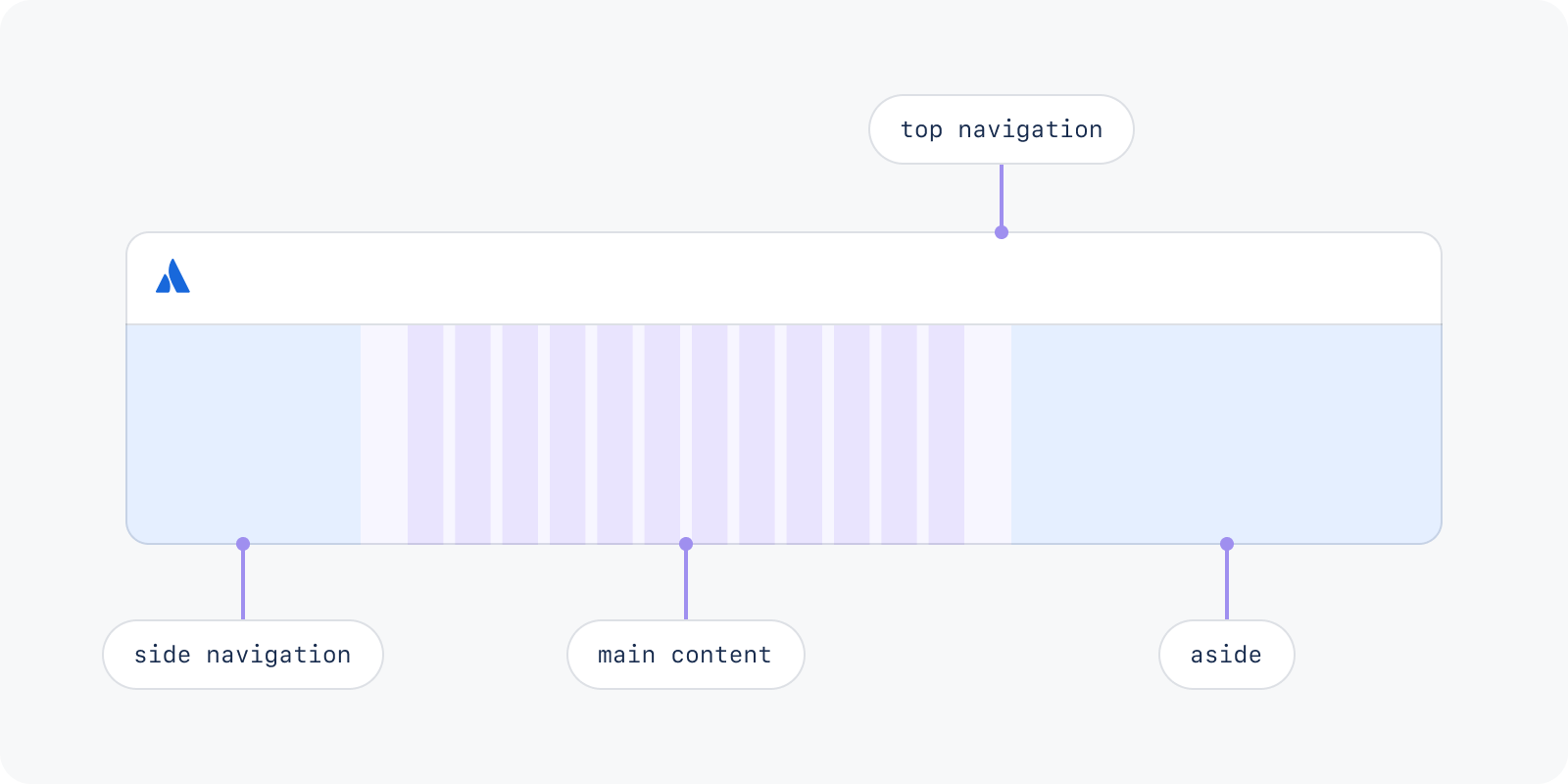
Use an aside to display supporting content on a screen, such as help panels or secondary tasks. The layout grid typically fills the full width of the viewport, but when the side navigation or aside is present, the grid should resize to fit the remaining area of the page.
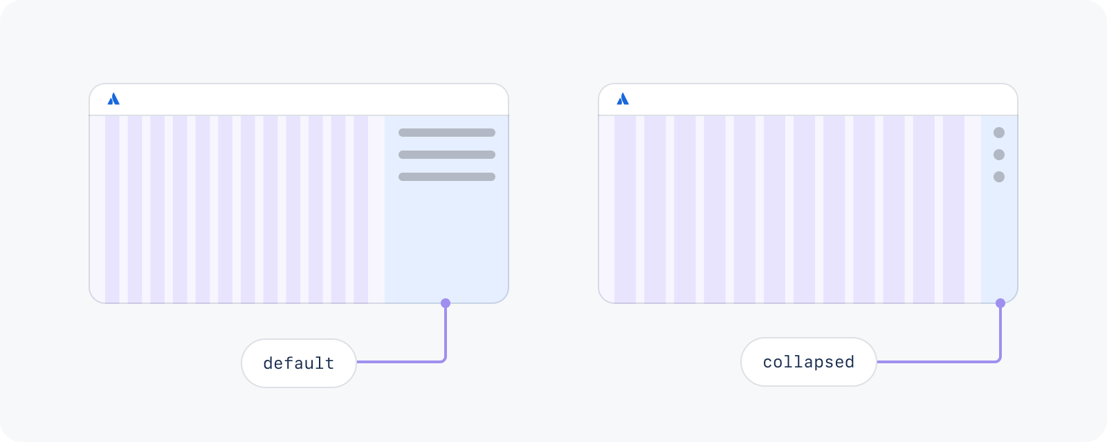
Some panels can be manually resized by users. Start with these standard sizes:
| State | Width | Suitable for |
|---|---|---|
| Side navigation | ||
collapsed | 56px | 768+px |
default | 320px | 768+px |
| Aside | ||
collapsed | 56px | 1024+px |
defaultSmall | 320px | 1024-1439px |
default | 400px | 1440-1767px |
defaultLarge | 504px | 1768+px |
Asides have two states: default and collapsed.
Was this page helpful?
We use this feedback to improve our documentation.