Follow these principles to create legible and visually balanced typography. Use in conjunction with the Atlassian color tokens and space tokens in product experiences.
 Optimize for readabilityHelp readers understand communications easily and enhance their experience, regardless of their abilities.
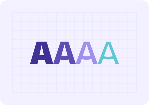 Create visual harmonyTypography should be consistent and cohesive. Use visual hierarchy and space to simplify complex information.
 Contextualize for different usersTailor for different preferences, operating systems and applications, while keeping in mind how people consume and process information.
When you need to express the Atlassian brand, such as in marketing, we use our custom brand font, Charlie Sans. Only authenticated users can download our brand fonts.
For all in-product experiences, use the typography system fonts. This ensures UI is optimized, performs well and is frictionless as you move between Atlassian products regardless of platform.
A font stack is an ordered list of fonts containing the primary font, and subsequent fallback fonts. Below is our product font stacks, we use sans serif fonts, except when representing code where we use monospaced fonts.
| Sans serif | Monospaced |
|---|---|
font-family: ui-sans-serif, -apple-system, BlinkMacSystemFont, "Segoe UI", Ubuntu, system-ui, "Helvetica Neue", sans-serif | font-family: ui-monospace, Menlo, "Segoe UI Mono", "Ubuntu Mono", monospace |
Text styles and typography tokens are made up of specific font values, including font family, font size, and line height. Where text styles appear in design and Figma, typography tokens are used in code.
Use heading, body and code text styles and tokens in your designs. Each style has optimized spacing values based on font size, and is designed to work with our other foundations such as spacing and color. These typographic decisions are built-in into typography tokens and will enable typography theming in the future.
We also recommend using heading and text components in code to simplify implementation of typography tokens.
Learn more about applying typography tokens and text styles.
Typography tokens use rem units instead of pixel values for font-size and line-heights. Font size is calculated dynamically by multiplying the rem unit with the browser default size of 16px (i.e. 1rem is equal to 16px).
Unlike pixels which are absolute (or fixed), rem are relative units that adjust according to the root element (html) size. Using rem units allow users to adjust the size of text depending on their needs or browser size, improving the responsiveness and accessibility of designs.
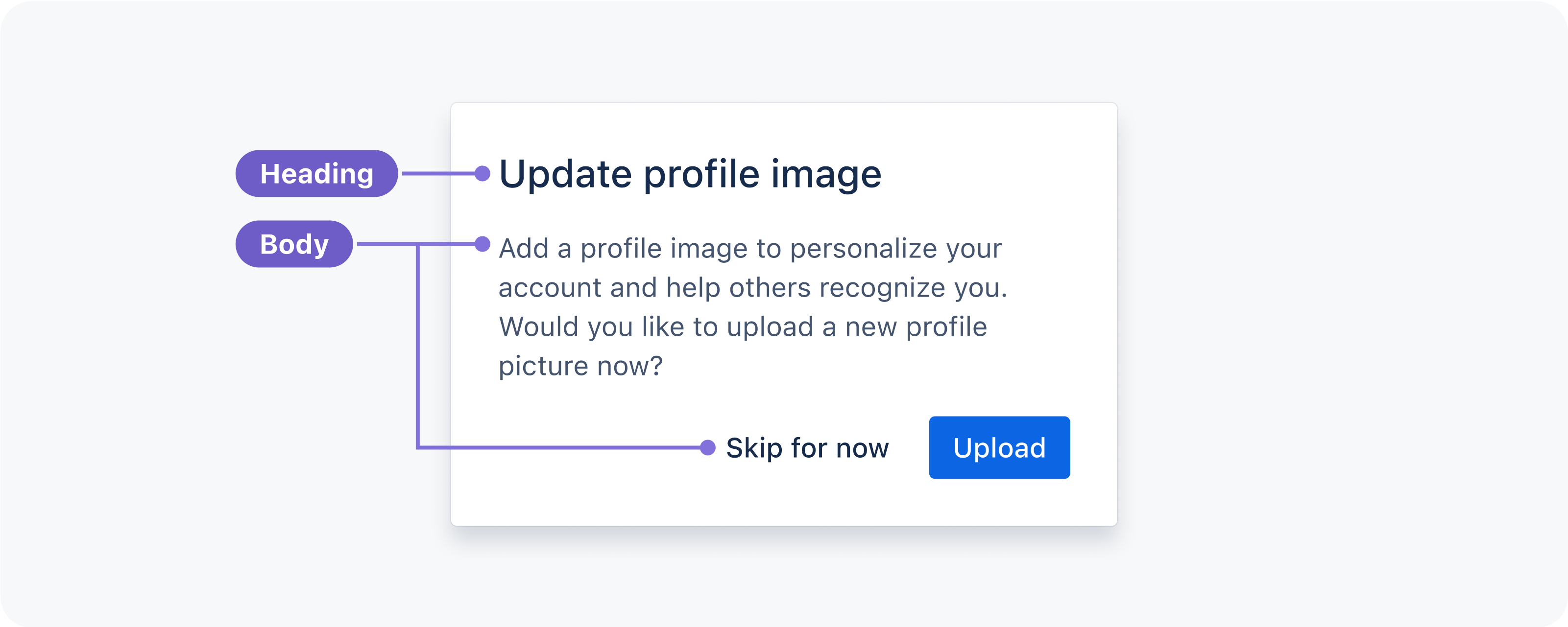
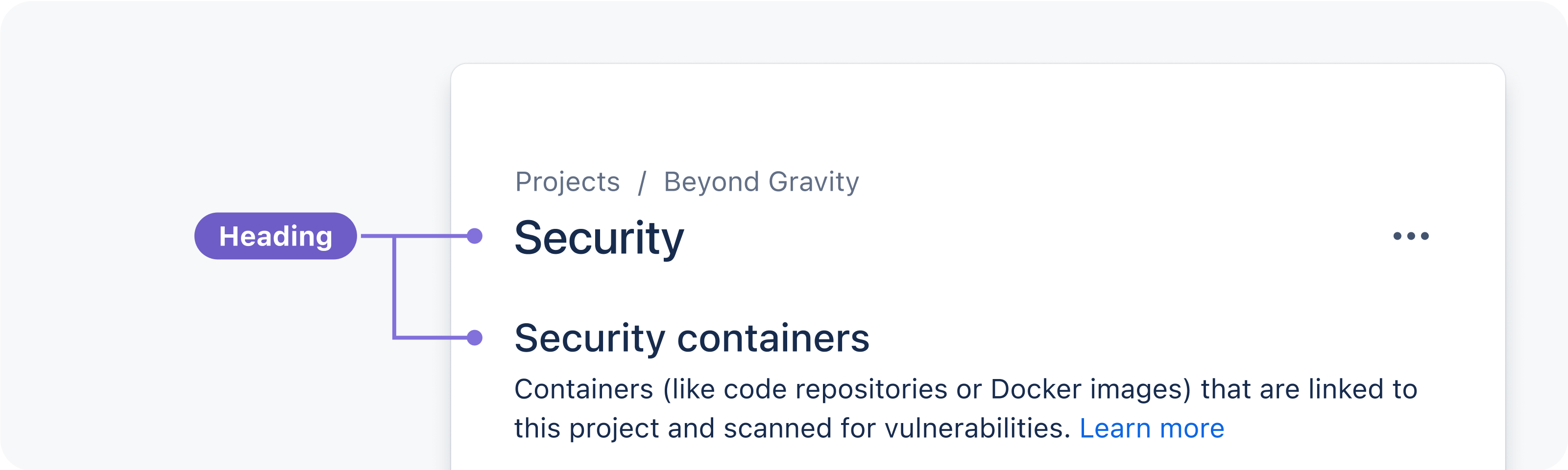
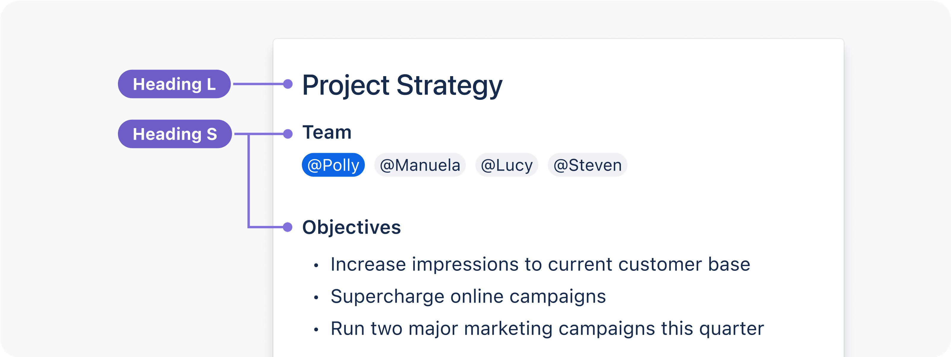
Use headings for page titles or subheadings to introduce content. Headings are sized to contrast with content, increase visual hierarchy, and help readers easily understand the structure of content.
Headings come in a range of sizes, for use in different contexts:
XXL and XL are suitable for brand and marketing content.
XL and L are suitable for page titles in products such as a form title.
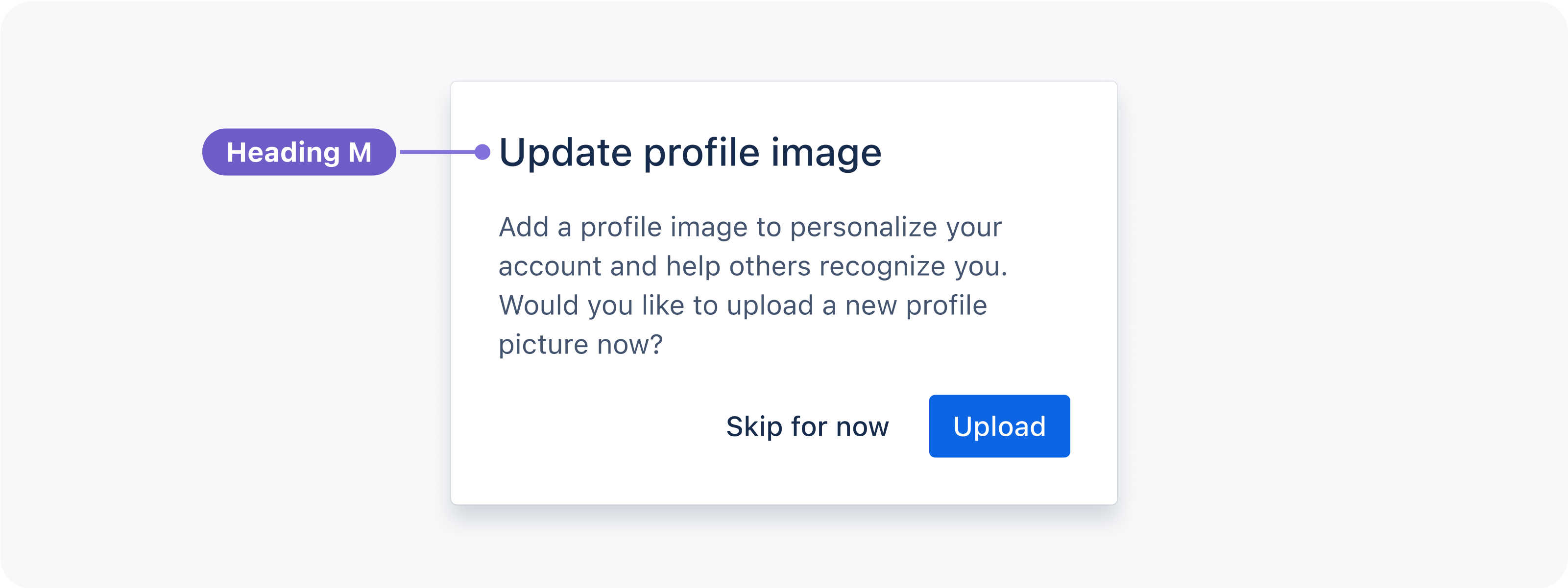
M can be used in large components where space is not limited and perfectly balances with Body M, such as modals.
S and XS are for titles in small components where space is limited, such as flags.
XXS should be used sparingly and is suitable matched with Body S, for example, in fine print.
| Preview | Token | Font weight | Font size | Line height |
|---|---|---|---|---|
Aa | font.heading.xxlarge | 500 / Medium | 2.1875 rem / 35 px | 2.5 rem / 40 px |
Aa | font.heading.xlarge | 600 / Semibold | 1.8125 rem / 29 px | 2 rem / 32 px |
Aa | font.heading.large | 500 / Medium | 1.5 rem / 24 px | 1.75 rem / 28 px |
Aa | font.heading.medium | 500 / Medium | 1.25 rem / 20 px | 1.5 rem / 24 px |
Aa | font.heading.small | 600 / Semibold | 1 rem / 16 px | 1.25 rem / 20 px |
Aa | font.heading.xsmall | 600 / Semibold | 0.875 rem / 14 px | 1 rem / 16 px |
Aa | font.heading.xxsmall | 600 / Semibold | 0.75 rem / 12 px | 1 rem / 16 px |
Please note: H100 and H300 styles have been deprecated and are no longer available. We recommend you update instances of H100 and H300 to the font.heading.xxsmall token.
Use body text for main content. They typically appear after headings or subheadings as detailed descriptions and messages, but also as standalone text in components. Body text includes additional paragraph spacing for readability and flow in blocks of text.
Body text comes in three sizes, for use in different contexts:
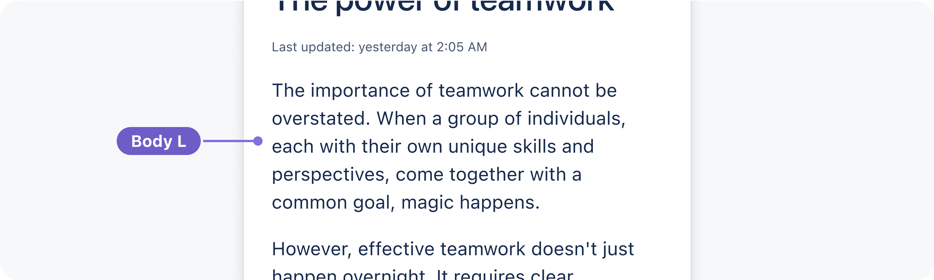
Body L is the default size for long-form content. Use this size for a comfortable reading experience such as in blogs.
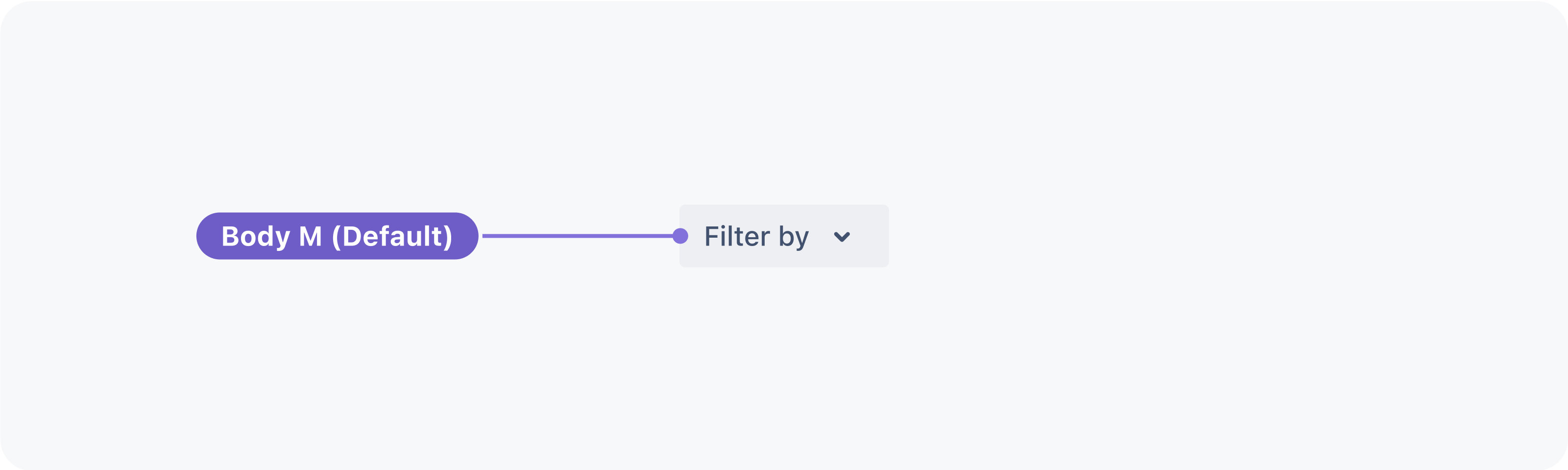
Body M (Default) is the default size in components or where space is limited, for detailed or descriptive content such as primary descriptions in flags.
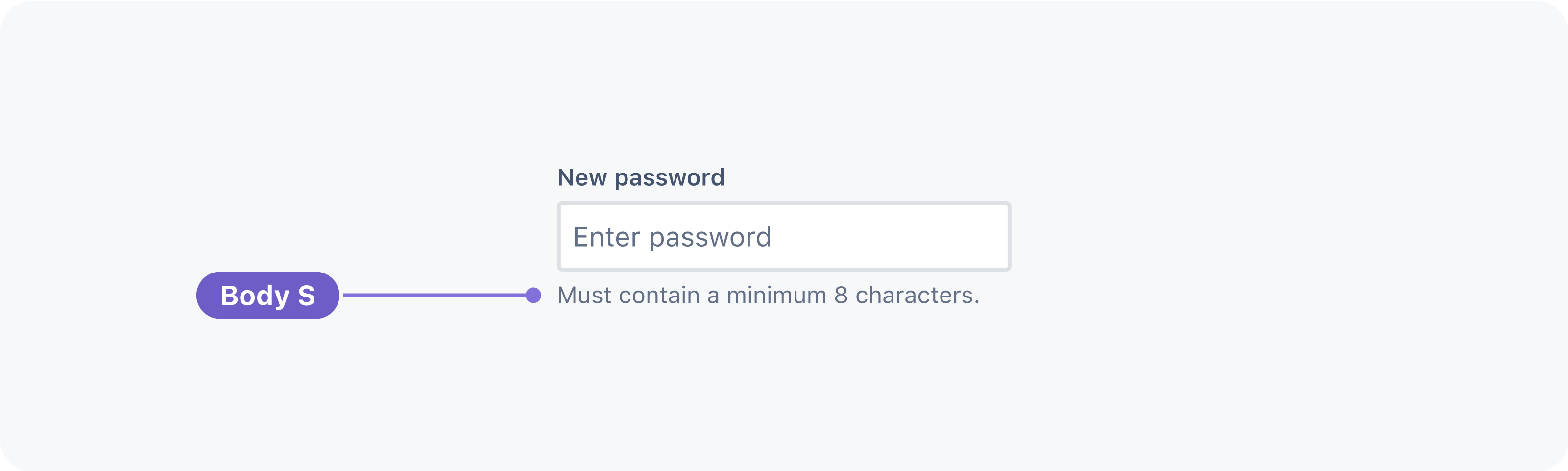
Body S should be used sparingly and is for secondary level content such as fine print or semantic messaging.
| Preview | Token | Font weight | Font size | Line height | Paragraph spacing* |
|---|---|---|---|---|---|
| Aa | font.body.large | 400 / Regular | 1 rem / 16 px | 1.5 rem / 24 px | 1 rem / 16 px |
| Aa | font.body | 400 / Regular | 0.875 rem / 14 px | 1.25 rem / 20 px | 0.75 rem / 12 px |
| Aa | font.body.small | 400 / Regular | 0.6875 rem / 11 px | 1 rem / 16 px | 0.5 rem / 8 px |
* See paragraph spacing below.
Paragraph spacing
Paragraph spacing is set in Figma text style libraries only. To represent paragraphs in code, use separate text components for each paragraph and manage paragraph spacing with the stack component.
Font weight is applied through the choice of text style in Figma, or through font weight tokens in code. Three weights are available for body text:
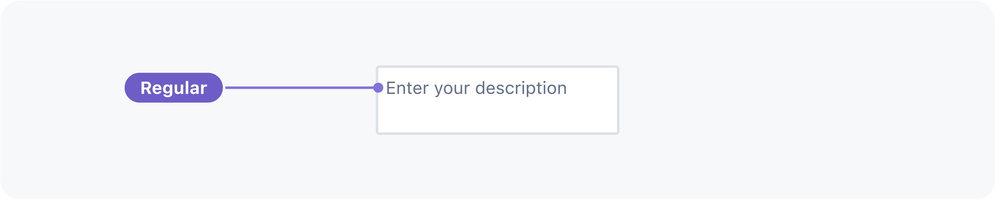
Regular weight is for generic paragraphs to contrast with headings, and medium text in components.
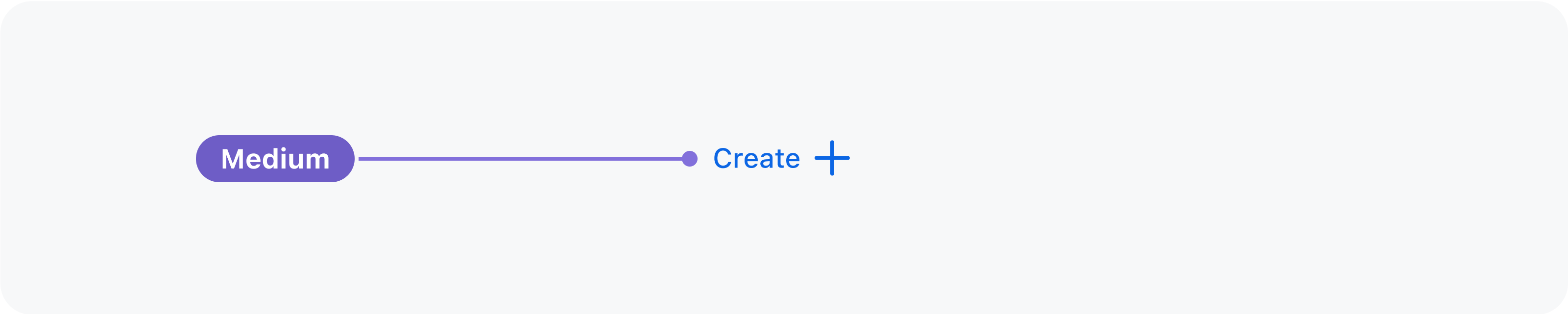
Medium weight is for alignment with iconography. Use this weight in most components and whenever text could be seen beside line icons.
Bold weight is for unique cases where text needs to be differentiated or given more emphasis. Use this weight sparingly.
The code text style is reserved for representing code in our code block component.
| Preview | Token | Font weight | Font size | Line height |
|---|---|---|---|---|
| Aa | font.code | 400 / Regular | 12 px | 20 px |
Code can also appear inline following the style settings of the block of text it sits within. In this context, this token is relative to its container's font size. Assuming a container font size of 14 px (0.875 rem), this token will have a font size of 12.25 px. The line height is equal to the container's font size.
Was this page helpful?
We use this feedback to improve our documentation.