Applying Grid
How to apply our layout grid in your designs.Usage guidelines
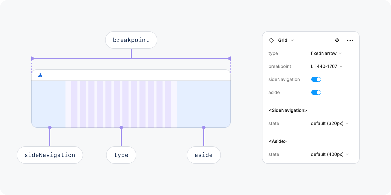
Our new grid component has inbuilt side panels, including the side navigation and aside, which automatically resizes the grid to cover the main content area. To set up the grid:
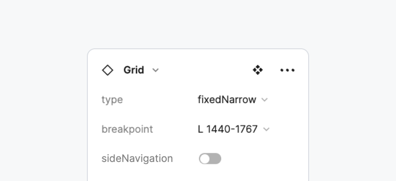
Determine grid type
Select grid breakpoint
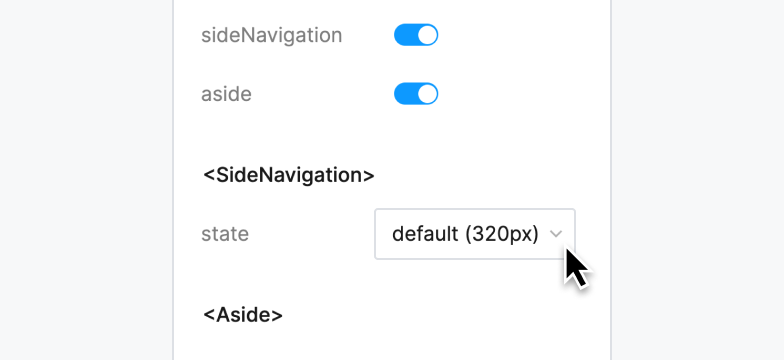
Configure sideNavigation and aside
Align content to grid
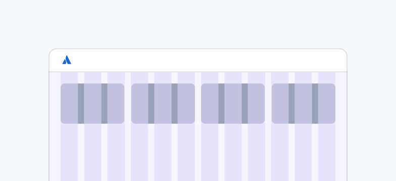
Step 1: Determine grid type
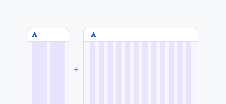
There are 2 grid types:
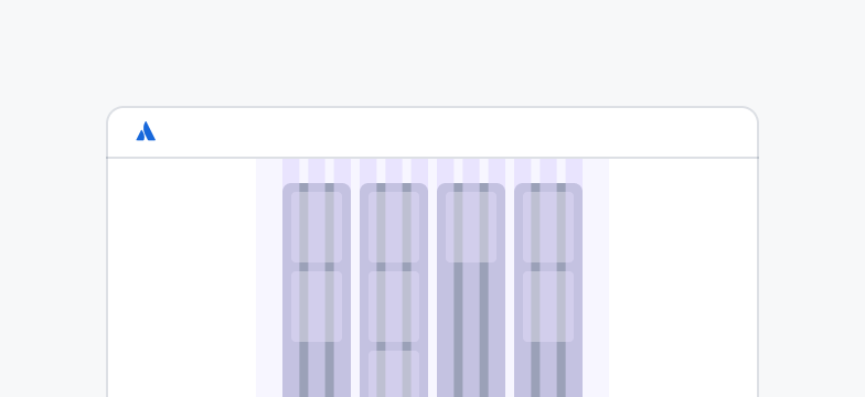
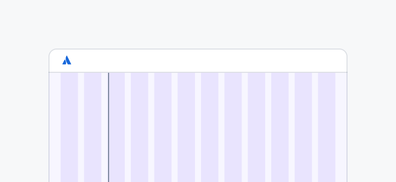
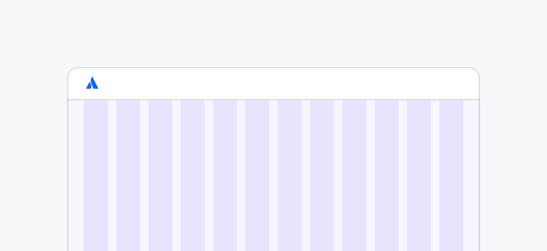
Fluid grids fill the width of the screen
Fixed grids stretch to a max-width and then remain centered
Do
Use fluid grids for information-dense pages, such as kanban boards, to maximise screen real estate.
Don’t
Don’t use fluid grids for content-focused pages. Long line lengths impair readability.
Do
Use fixed grids for content-focused pages, such as blogs and articles, to improve readability.
Don’t
Don’t use fixed grids for information-dense pages. Limiting screen space will truncate important content.
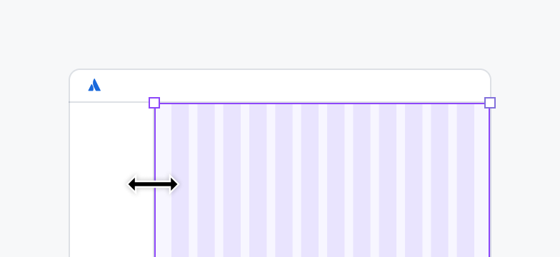
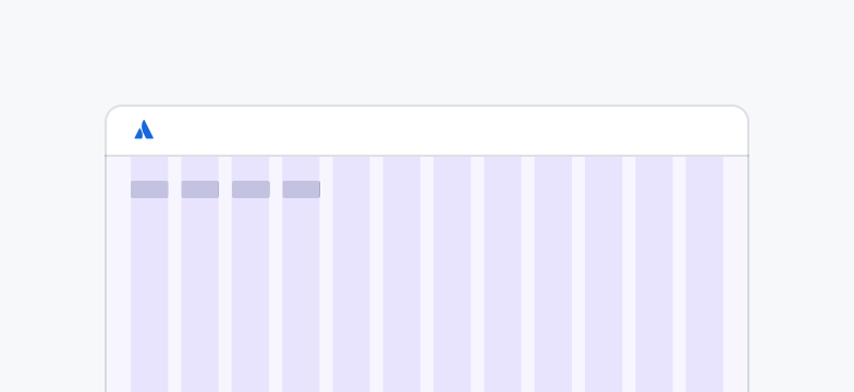
Step 2: Select grid breakpoint
There are 6 grid breakpoints:
XXS, XS and S for small viewports from 320-1023px
M, L and XL for large viewports from 1024+px

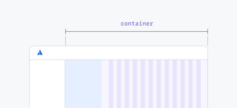
Do
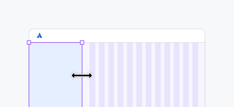
Span only the main content container. Exclude the side navigation and asides.
Don’t
Don’t span the entire screen width or include asides. The grid spacing is suitable for main content only.
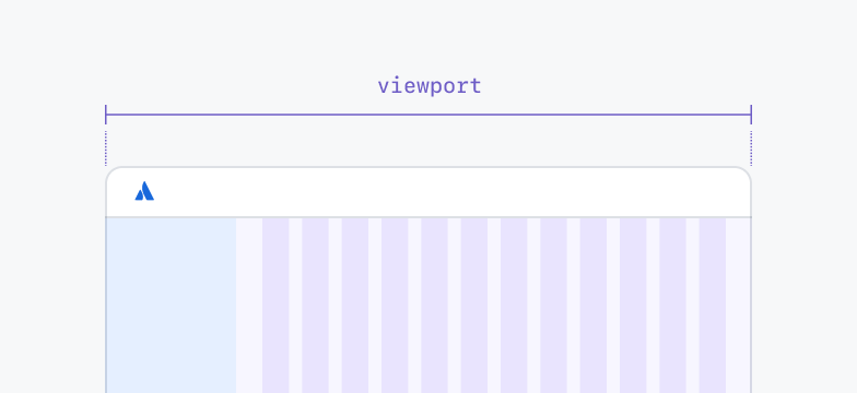
Do
Set the grid breakpoint to the full viewport width.
Don’t
Don’t set the breakpoint to the container width. The grid spacing is scaled for the full viewport width.
Do
Change the breakpoint using the component variant.
Don’t
Don’t change the breakpoint by resizing the grid container. The linked grid styles will map incorrectly.
Do
Provide designs for at least 2 breakpoints, preferably more and for different devices.
Don’t
Don’t provide designs for only 1 breakpoint. Engineers need layout guidance for other breakpoints too.
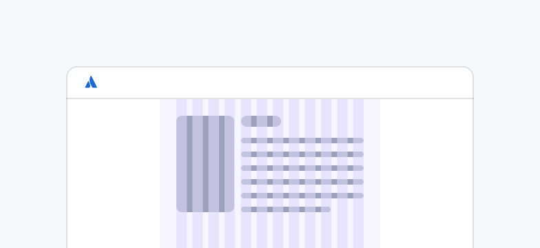
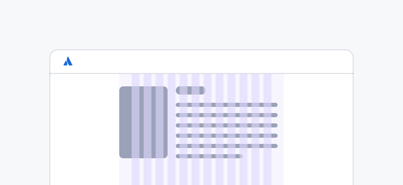
There are 2 types of panels:
Side navigation: generally on the left, with collapsed and default states
Aside: generally on the right, with collapsed and default states where widths change at different breakpoints
Do
Follow the standard aside widths that are defined in the grid component properties.
Don’t
Don’t create custom aside sizes. This leads to inconsistent page layouts.
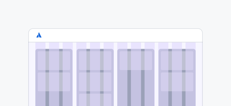
Step 4: Align content to grid
The vast majority of content should align to the grid, but exceptions can be made based on context. Use spacing tokens and layout primitives to structure content that doesn’t align to the grid.
Do
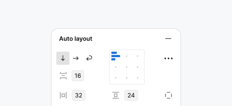
Use auto layout in Figma to align content, with appropriate spacing tokens.
Don’t
Don’t manually align content or set custom (non-token) values. This is not scalable and creates room for error.
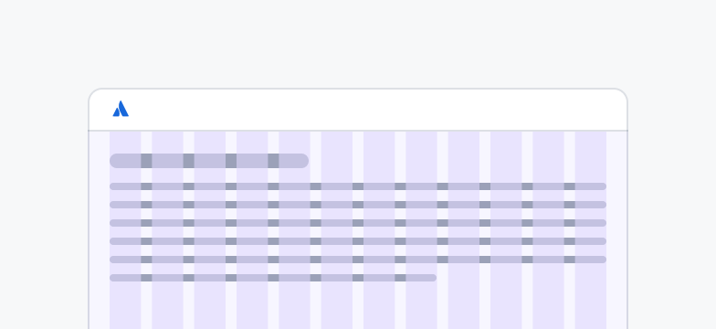
Do
Align large content elements, such as cards to the grid.
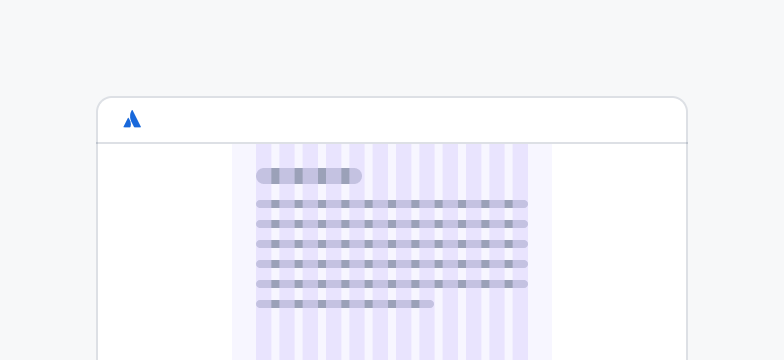
Don’t
Don’t align small content elements, such as button groups, to the grid. Instead, use layout primitives.
Do
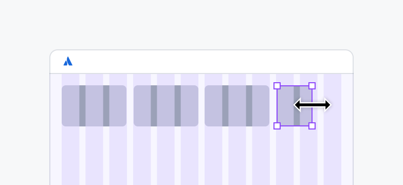
Align content across any number of columns required.
Don’t
Don’t allow content to overflow into gutters and margins, as this does not align with the grid.