Reinventing our iconography system at scale: the journey behind the screens
Meet Atlassian’s new iconography and the system that brings it to lifeIcons are a cornerstone of Atlassian’s visual language. They guide customers through complex interfaces, make actions recognizable, and shape the overall app experience. After six years with a system of more than 350 icons created by different product teams, we had an opportunity to evolve.
In this blog, we’ll share how we reimagined Atlassian’s iconography—building a new system that brings clarity, cohesion, and quality at scale, while supporting the evolving needs of our apps and customers.
Over time, shifts in market preferences and new technical requirements revealed the limits of our legacy icon set. Because icons appear everywhere in our apps, even small inconsistencies became noticeable: variable sizing and spacing, conflicting metaphors, and a style that felt too heavy for today’s UI. Teams also designed bespoke icons in isolated repositories whenever gaps arose in the system. This flexibility helped apps ship faster, but it came at the cost of consistency, leading to duplication across apps.
Together, these challenges highlighted an exciting opportunity: to modernize Atlassian’s iconography, resolve inconsistencies, and establish a scalable, future-ready foundation that empowers both our designers and our customers.
Crafting a bold, fresh look for icons
Refining stroke width and alignment
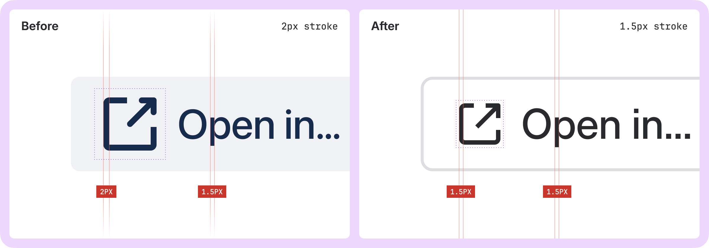
In our legacy system, icons were drawn with a 2px stroke on a 24px canvas, making them visually heavy compared to the rest of Atlassian’s UI. So much so that designers would use a lighter shade of gray for icons next to text, to reduce the icon’s visual emphasis. To create harmonious balance with our recently updated typography system, we re-drew new icons with a thinner 1.5px stroke on a 16px canvas. We took special care to ensure icon stroke edges align to the pixel grid, maximizing crispness and legibility on lower resolution displays.
 Icon size and stroke width in the new icon system provides balanced harmony with type styles
The new Atlassian brand language introduced bold, geometric shapes. These are striking in marketing and branding materials but when we tested them in our apps they overpowered the rest of the UI. To adapt, we combined the brand's angular qualities with the rounded features of our new typeface, Atlassian Sans, and applied lighter-weight outlined forms. The result is an icon style that both feels balanced within our apps, and aligned with Atlassian’s broader brand language.
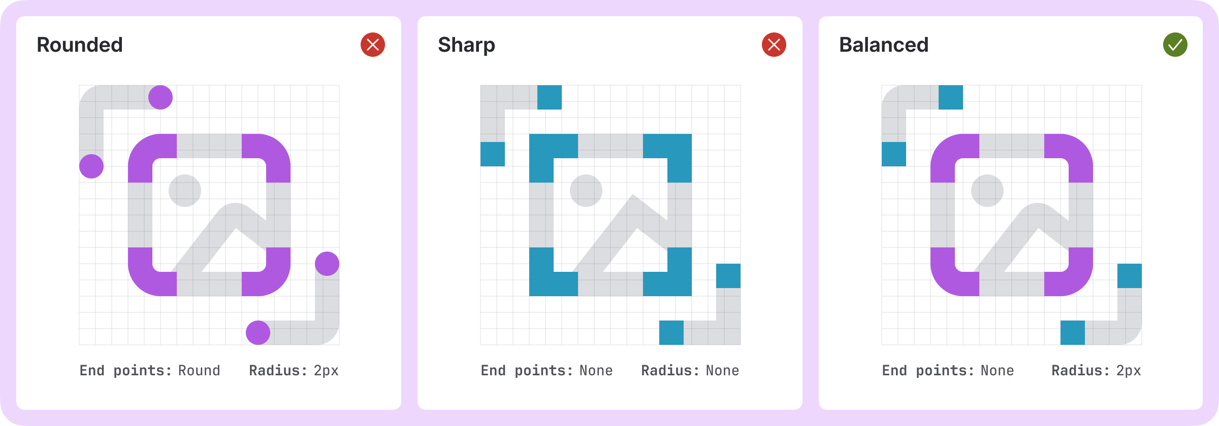 Exploring radius and stroke terminals to find the optimal balance for the app expression of our iconography system
Creating balance with icon sizing
Icons in our legacy icon system were inconsistently sized, with many icons appearing too large. As a result, designers and developers often scaled icons down to achieve visual balance, which resulted in variations in stroke width, padding, and size, diminishing the visual cohesion of our apps.
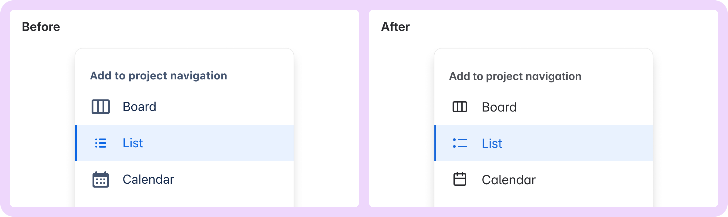
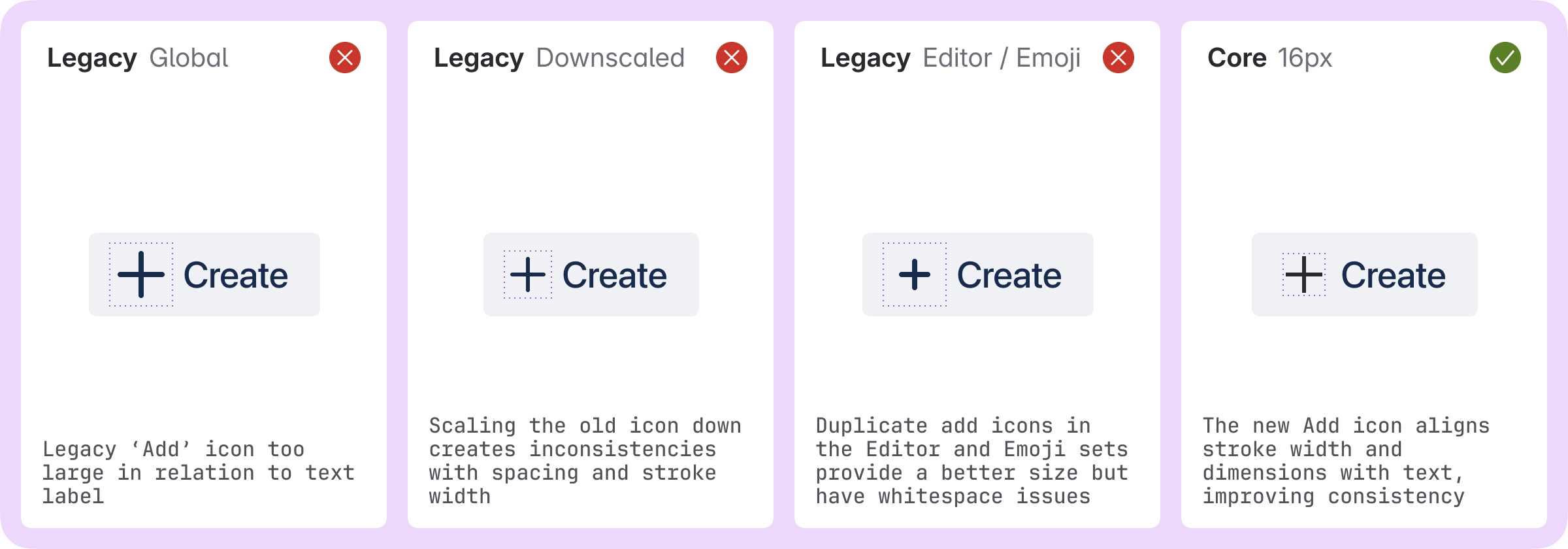 Here, the “Add” icon looks different depending on which icon and size is used
To resolve the sizing inconsistencies, we consolidated to a single, “core” icon set. These new icons, sized at a comfortable 16×16 pixels, optically sit between the old “small” and “medium” sizes and match the stroke of standard UI text.
While this size worked in most contexts, there were some places, such as compact buttons and metadata, where smaller icons were required to maintain balance. For example, in the legacy system, chevron icons either looked too large or had too much surrounding whitespace when used in buttons.
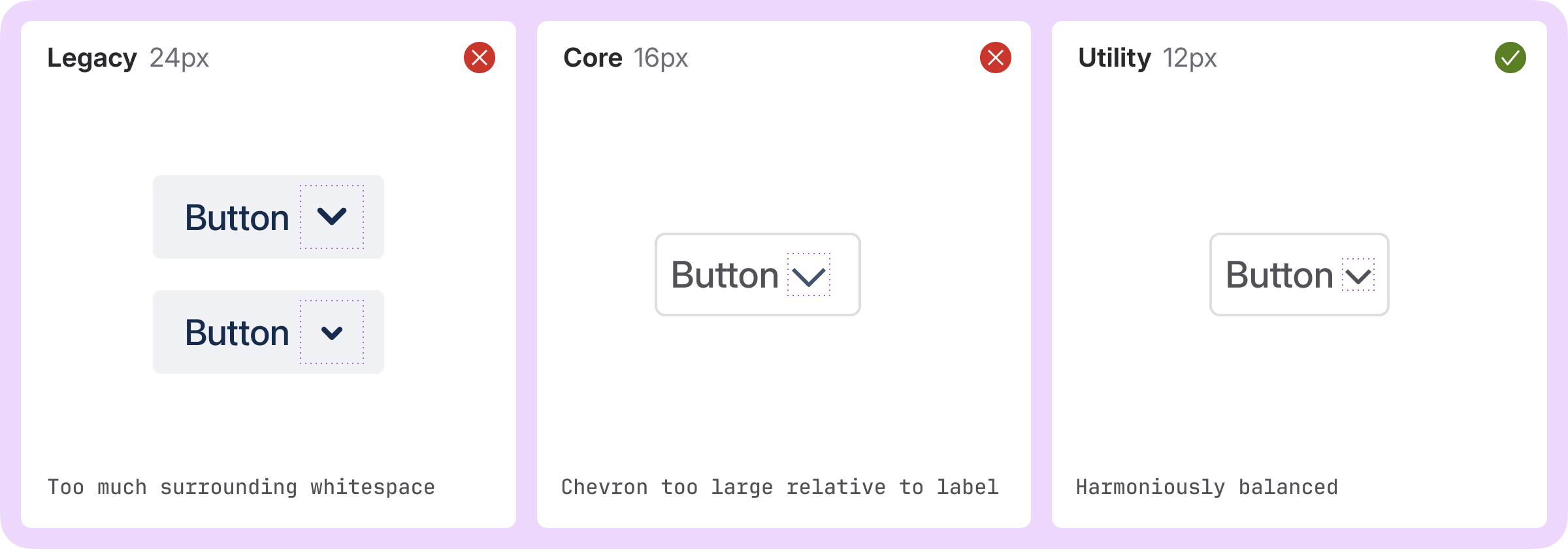 Legacy icons contained too much whitespace around icon glyphs, leading to inconsistent custom workarounds.
To counter these issues, we trialled a small set of specifically drawn 12×12 pixel ‘utility’ icons which maintained the 1.5 pixel stroke width, designed to cover specific cases like chevrons and metadata. However, as Atlassian’s visual language evolved, more teams needed to place icons in tight spaces next to small text, like in tags or bylines, and the limited set of utility icons was too restrictive.
To support these emerging needs, we needed to provide the entire icon set at 12 pixels without the extensive effort required to draw every icon at multiple sizes. We decided to offer 12-pixel downscaled versions of our existing core 16-pixel icons.
While we were initially concerned that downscaling icons would impact legibility, in practice, the effort to ensure legibility at the larger 16-pixel size meant that reducing both size and stroke worked well. In fact, downscaling the icons resulted in greater consistency between the stroke weight of these icons and the smaller text they were used with. This harmony can be seen in smaller, contained metadata elements such as tags and metadata.
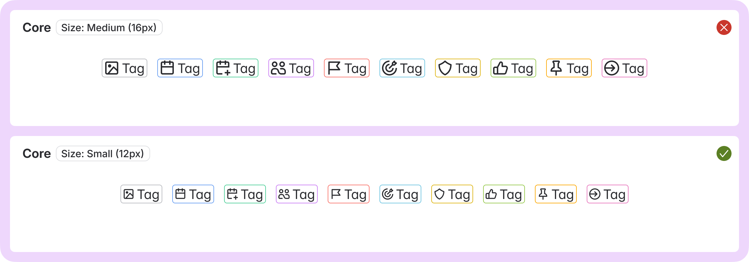 Downscaled 12px icons harmoniously balance size and stroke width with accompanying text in smaller tag-like elements.
Bringing it all together as a unified language
In partnership with product designers across Atlassian, the design system team has crafted a modern and harmonious icon system that unifies our brand and app design languages, promotes consistency, and feels as if it were designed by one hand.
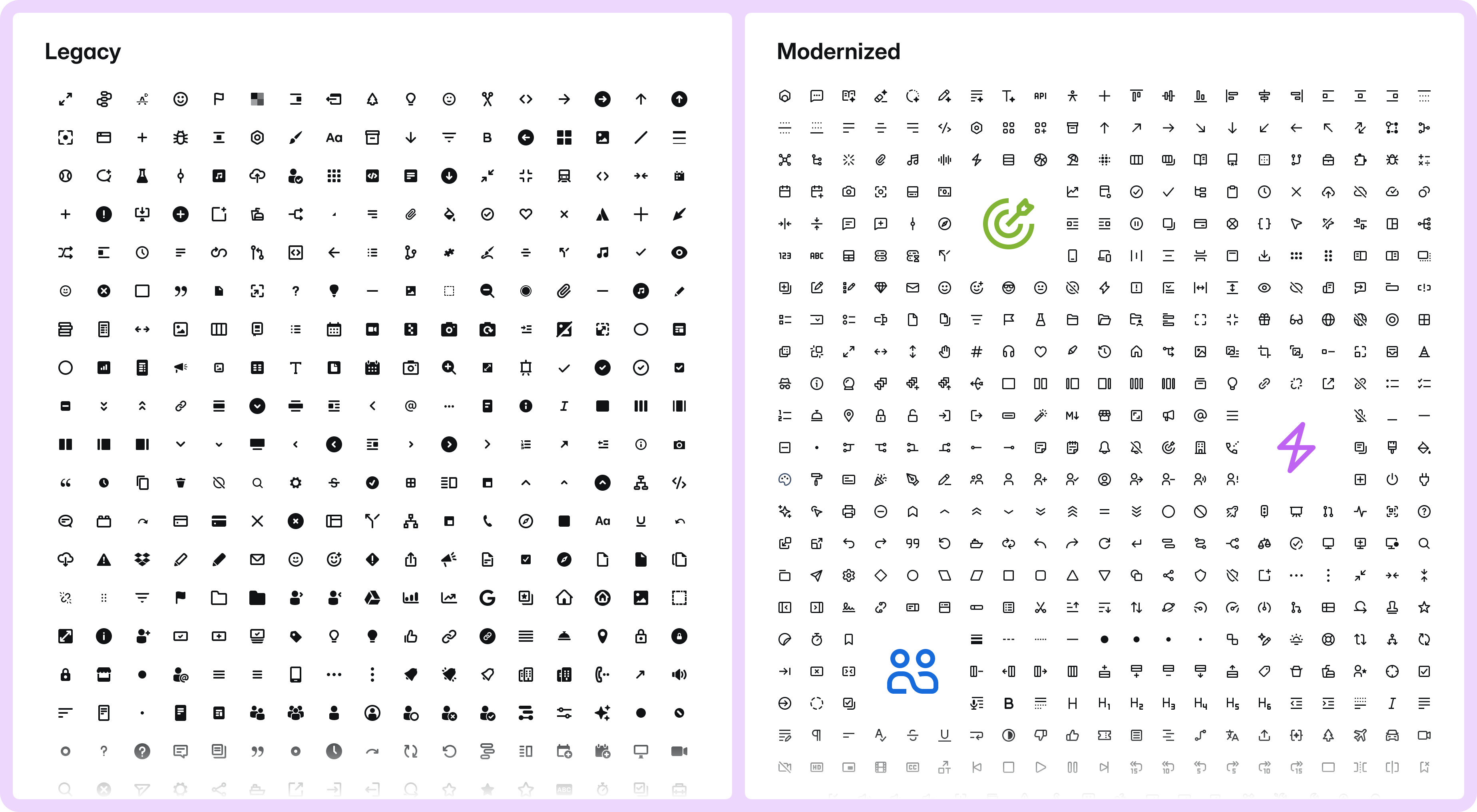 The old and new icon sets side by side, only the Modernized set passes the ‘squint test’ as all icons look like they are part of the same family 🤩.
Creating a unified, collaborative experience for using icons
Refreshing an icon system is not just about ‘swapping out the pictures’. It’s about the whole end-to-end experience of using icons as an Atlassian: from the initial migration, to the ongoing usage experience, to how we effectively grow and evolve the set into the future.
Creating a taxonomy to drive consistent usage
Our investigations found that single icons were often used to convey different meanings across Atlassian experiences. Iconography provides a powerful visual signifier for representing features, actions, and system objects — but only if its visual metaphor is used consistently. Using an icon for something other than its specific purpose can confuse users and may even lead to them performing actions with unintended consequences. Clear naming and usage guidance are essential to address these issues.
That said, this rule doesn’t apply to every icon. When we talked to users of our design system and to the talented folks from the design systems at Spotify, Shopify, and Slack, we learned that while some icons have one clear meaning or use case, others will always have multiple.
To solve this, we defined two icon categories: single-purpose and multi-purpose. Single-purpose icons have clear, dedicated usages and are named after the concept or feature they represent (for example, “Atlassian Intelligence,” “Work item,” “Share,” etc.), while multi-purpose icons don’t have a dedicated usage and are named literally to describe what they look like (for example, “arrow right,” “globe,” or “lightbulb”).
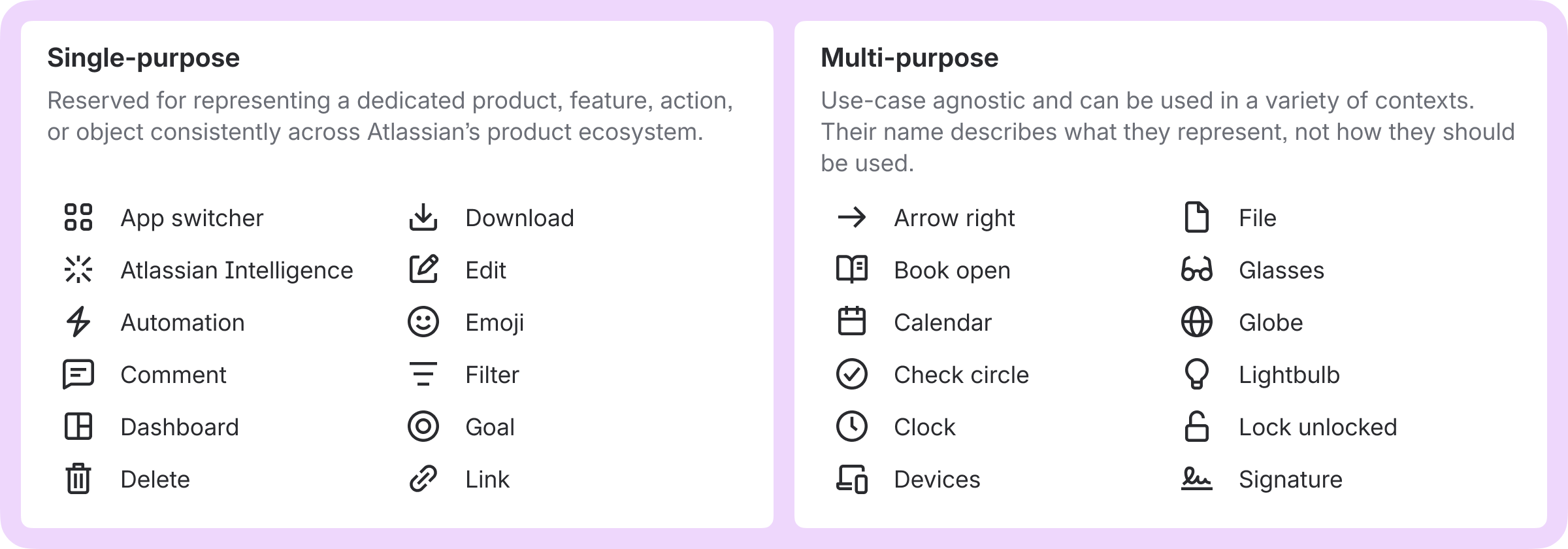 Single-purpose icons are named after what they mean, while multi-purpose icons are named by what they look like.
Building Icon Lab: A new home for icon contributions
The old icon system couldn’t accept new icons from teams outside of the design system team. When teams needed a new icon, they would create their own and house them wherever they could. This led to duplicates scattered across Figma files and codebases.
In fact, we audited Atlassian apps and identified over 1,000 custom icons of varying quality and consistency, many of which were different ways to represent the same thing. This was inefficient, didn’t scale, and affected the usability of our apps for customers.
To address this, we created Icon Lab, a new home for custom icons contributed by teams across Atlassian. Centralizing these icons into Icon Lab enables better collaboration between teams, and providing visibility of all icons in one place helps to avoid conflicting usage across apps. Icon Lab feels just like the core ADS icon package, and is even available from the core ADS Figma library.
To make it easier for teams to contribute to Icon Lab, we developed a custom Figma plugin. This plugin automates repetitive layout and export tasks, and prompts contributors to provide key information and usage guidelines for each icon. With one-click export, developers can quickly update our React component library and documentation with minimal effort.
We’ve already seen the benefits of Icon Lab in the development of new app features, with designers actively referencing the system for inspiration, and to ensure that their latest features are represented with an icon that’s distinct and recognizable.
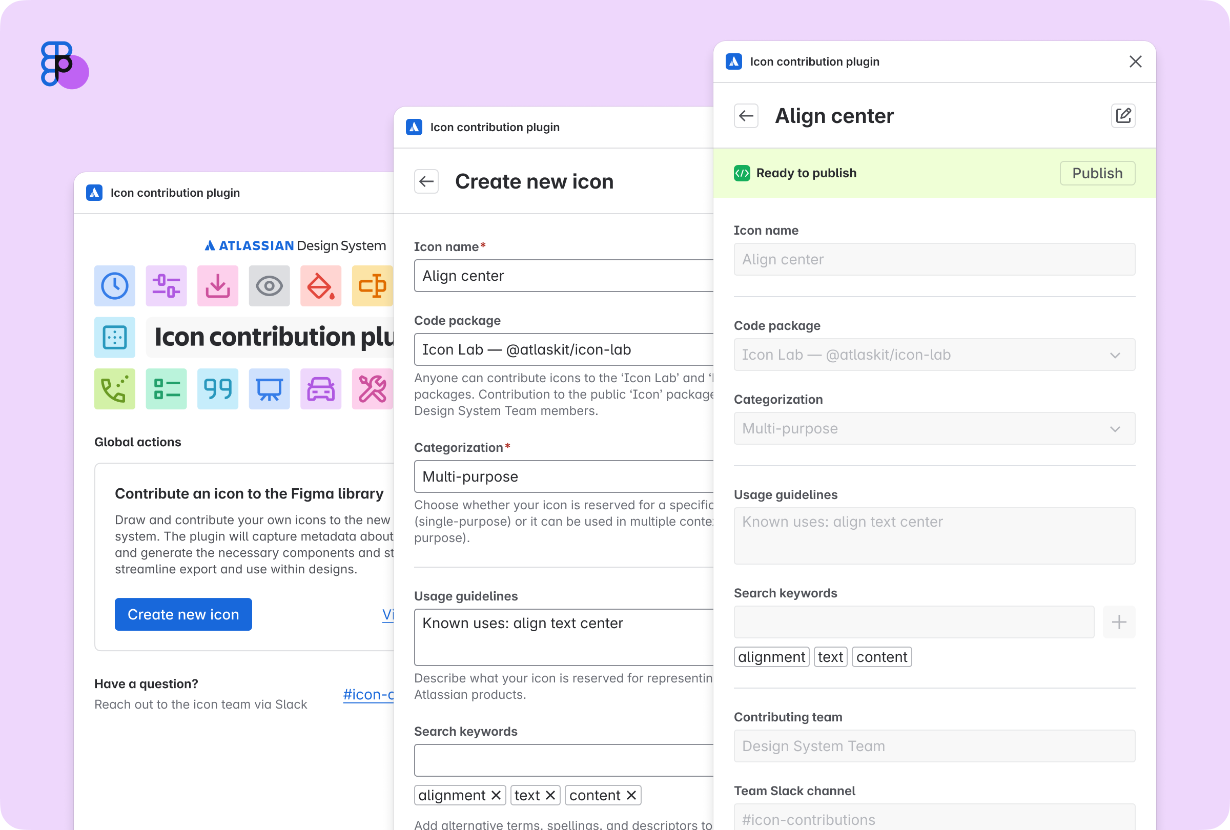 The icon contribution Figma plugin streamlines the contribution process by automating key creation, organization, export, and publishing tasks to make it easy for anyone to contribute to the system.
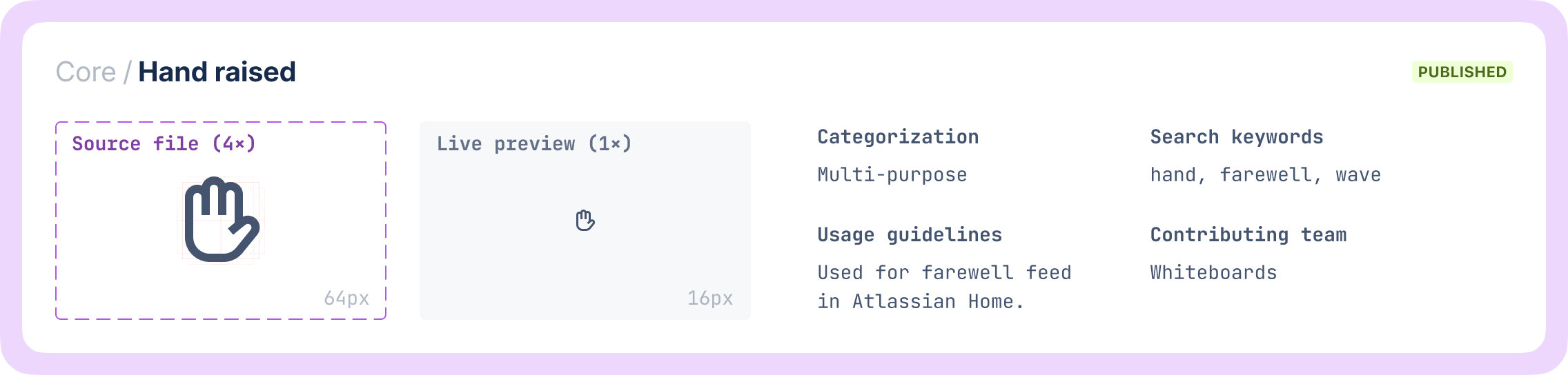 An example of an icon source card created by the Icon contribution plugin which automatically creates a component to house the 4x scale source file, a live-updating 1x preview, icon metadata, and publish status.
At Atlassian, we support our internal teams with a comprehensive set of guides and custom tooling to streamline icon design. These resources cover everything from planning and visual metaphor guidance, to drawing icons and contributing them to the system. This contribution model has enabled designers to contribute over 275 icons to the system already.
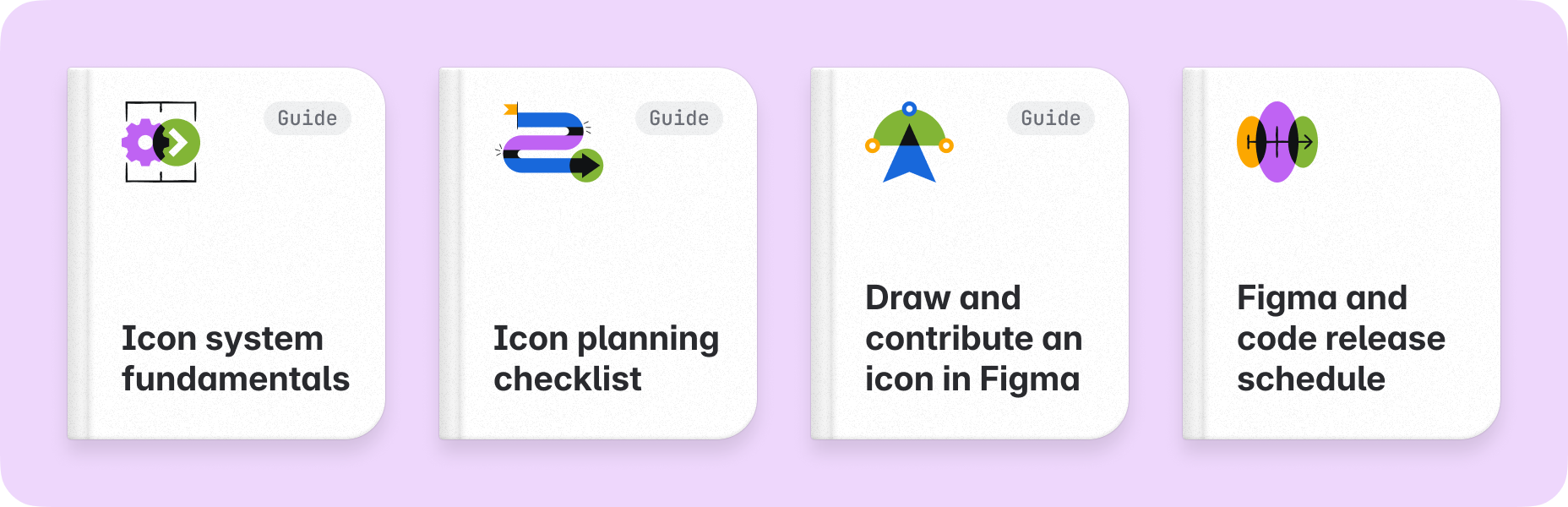 Guides for learning how to draw and contributing icons to the system.
Supporting migration at scale
Our new system is not just a new set of pictures. It introduced sizing and naming changes that required updates to more than 16,000 callsites across our codebase, and custom icons that needed to be found and replaced. To support teams migrating to and using new icons, we created a bundle of tooling and docs:
Feature flagging
It's always important for us to test changes of this scale before rolling them out, which in this case required enabling large-scale, feature-flagged swapping between icons. To avoid burdening teams with thousands of feature flags, we introduced migration entry points and backwards-compatibility props, which made it easy to support both old and new icons throughout the migration phase, without adding unnecessary workloads for teams.
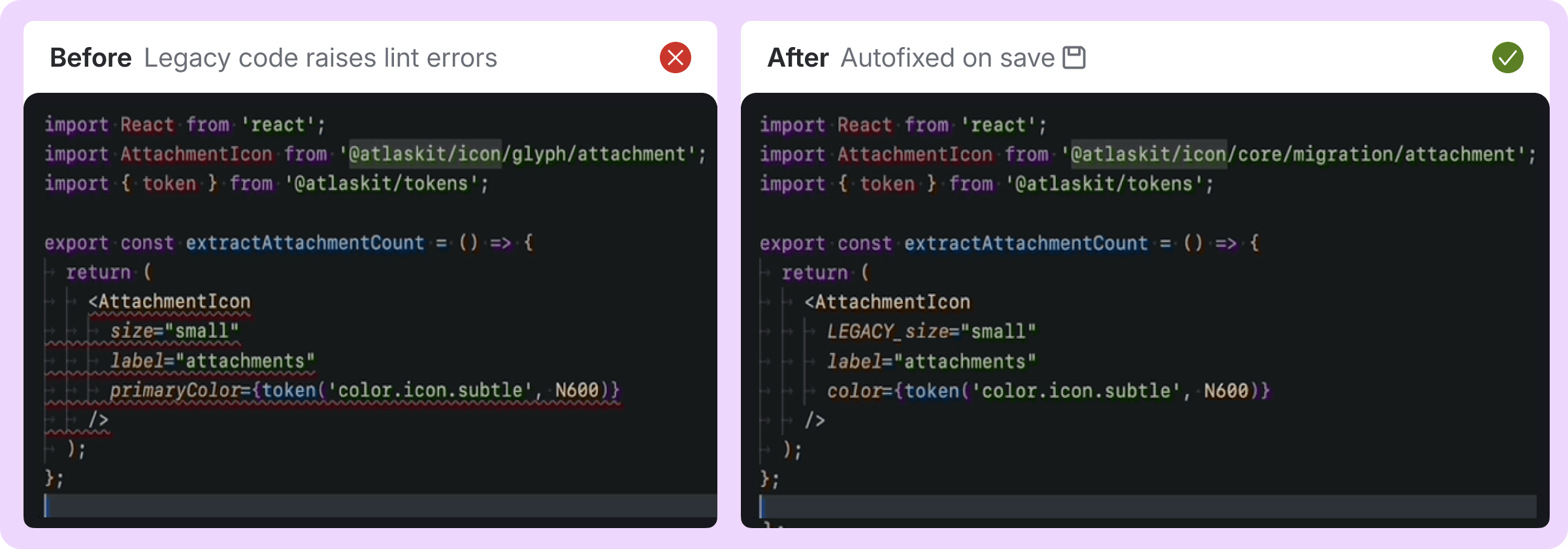
ESLint rule and auto-fixer
We created an ESLint rule in code that automatically finds legacy icons and migrates them (where possible) to the new API and designs. Powered by a manual mapping of the 350 old icons to their new counterparts, and a detailed set of migration rules, roughly 75% of icons could be migrated safely to the new set for testing and QA.
Icon Facade
The ESLint rule was powerful, but at Jira’s size, we needed a safer way to test icons across thousands of places, while the icon components were still in Beta. Our “icon facade” swapped many of our old icons to the new ones at runtime, with no migration required. This allowed Jira to focus on the difficult parts of migration and validate the new designs, which enabled the new icons to appear in apps months ahead of schedule.
 A before-and-after of our no-migration “facade” solution in action
Custom icon extractor
In addition to migrating all the platform components to the new icon set, we built a tool that scans a repo for all SVGs, screenshots them, and creates a document for manual review. This allowed us to find and re-draw icons used in our platform components ahead of code migration, and Confluence used it to audit all their custom icons early in their migration to start designing replacements.
Documentation and Icon Explorer
To allow teams to view the rich new icon set, including metadata, descriptions, and migration pathways, we created a powerful new icon explorer on atlassian.design that displays this information in a helpful, mobile-friendly UI.
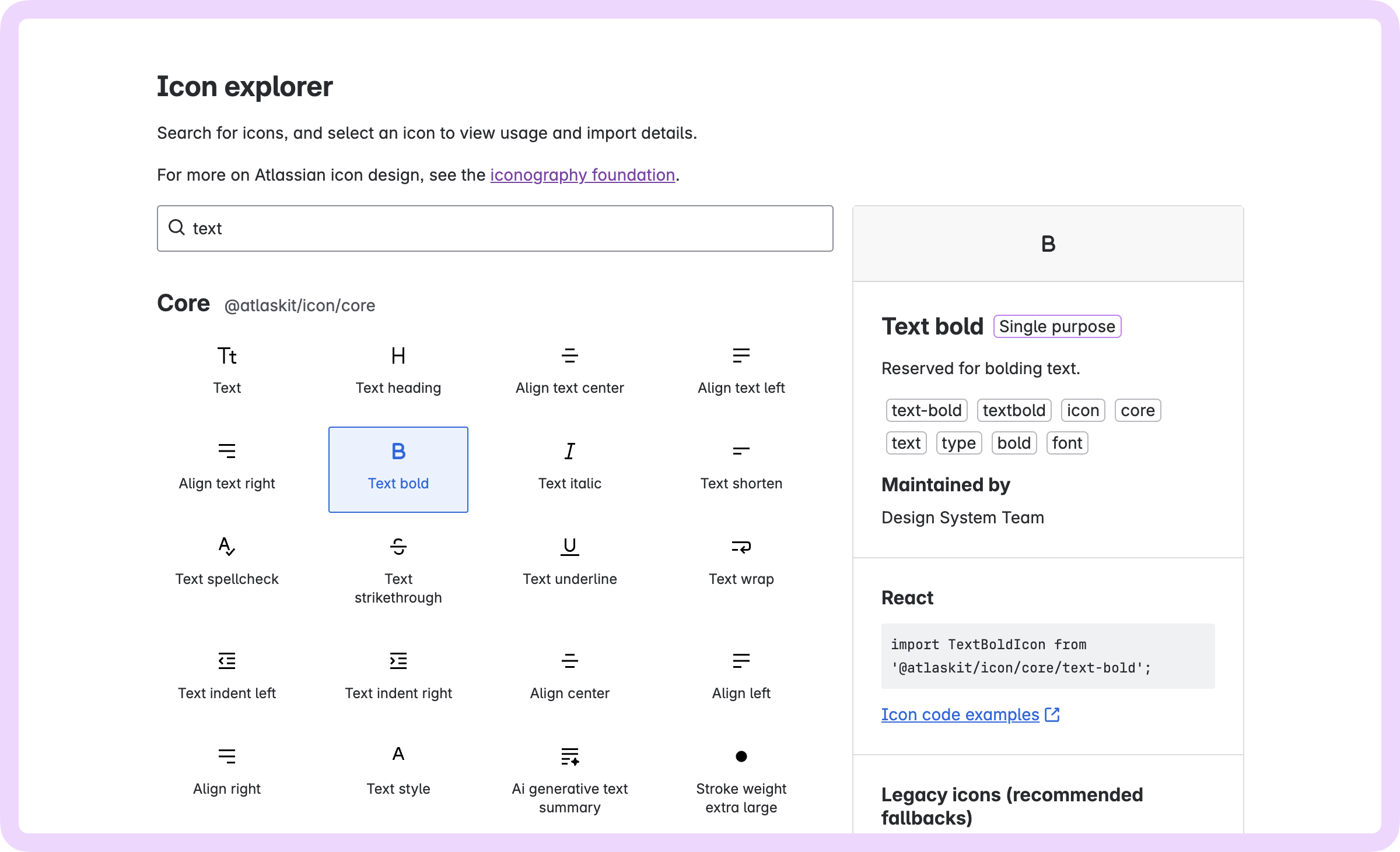 The icon explorer on Atlassian.design makes it easy to search for icons, view migration pathways, and copy code snippets for rapid implementation.
Together, these tools enabled one of the largest component migrations the Atlassian Design System team has ever performed, and in record time.
🎓 Lessons learned
This project has reinforced several key principles about building design systems:
Technical tooling is as important as visual and experience design. Our migration tools and contribution plugins were crucial to adoption success.
Centralization requires excellent supporting infrastructure. Icon Lab is succeeding because it makes contributions and discovery straightforward and easy to support.
Backwards compatibility and gradual migration paths are essential. Our feature flagging system and Icon Facade allowed teams to adopt changes at their own pace.
Clear categorization and naming conventions are fundamental. Conventions help maintain order as a system scales, by helping its users do the right thing.
🔭 Looking to the future
Atlassian users can now enjoy the benefits of our new iconography system across Atlassian apps, including Jira, Confluence, Trello, Focus, Talent, and our platform apps like Home, Teams, and Goals - with more to come.
We’re thrilled with the impact the icons have made on Atlassian’s UI through sizing, style, and visual weight, and how they’ve empowered designers across Atlassian. Our work on automated tooling for auditing, migrating, and feature flagging changes ensured a smooth roll-out process for engineering teams and enabled a large-scale change to ship to customers faster than ever. Additionally, the new foundations of our system better support open contribution, ensuring that future changes will be easier to test, validate, and implement.
Like our team’s recent work on Typography, overhauling Design System Foundations can be challenging at the enterprise level - but by focusing on clear, simple design principles and investing in quality tooling, these changes drive internal efficiency and enhance the customer experience.
Have feedback on our new iconography system?
Tell us what you think by filling in the feedback form at the bottom of our iconography foundations page.
❤️ Jesse Bauer, Daniel Hoolahan, Eleni Misthos, Jinju Narimatsu, Zac Sanderson-Harris, Andrew Campbell, Akshay Saini, Sim Saini, Luke Underwood, Meng Xiao, Stephen Mok, Andrew Vohmann, Lewis Ethan-Healey, Daniel Del Core, Jocelyn Wong, Greg Smith, and the whole Atlassian Design System team.