Applying motion
Practical guidance for applying motion to components and experiences.Using motion tokens
Use semantic motion tokens whenever you're working with components that have similar behaviors and functions to the semantic categories defined in the system.
Start by identifying what the component is doing, then map that behavior to the closest semantic motion category. Once you’ve found a match, apply the corresponding semantic token rather than creating something new. This keeps motion consistent across components that behave similarly and reduces the need for bespoke timing or easing decisions.
These tokens map specific motion behaviors to component contexts, grouped by category.
Interactions
| Token | Component |
|---|---|
motion.avatar.hovered | Avatar |
motion.avatar.pressed |
Transitions
| Token | Component |
|---|---|
motion.flag.reposition | Flag |
motion.avatar.enter | Avatar group |
motion.avatar.exit | |
motion.blanket.enter | Modal |
motion.blanket.exit | |
motion.flag.enter | Flag |
motion.flag.exit | |
motion.modal.enter | Modal |
motion.modal.exit | |
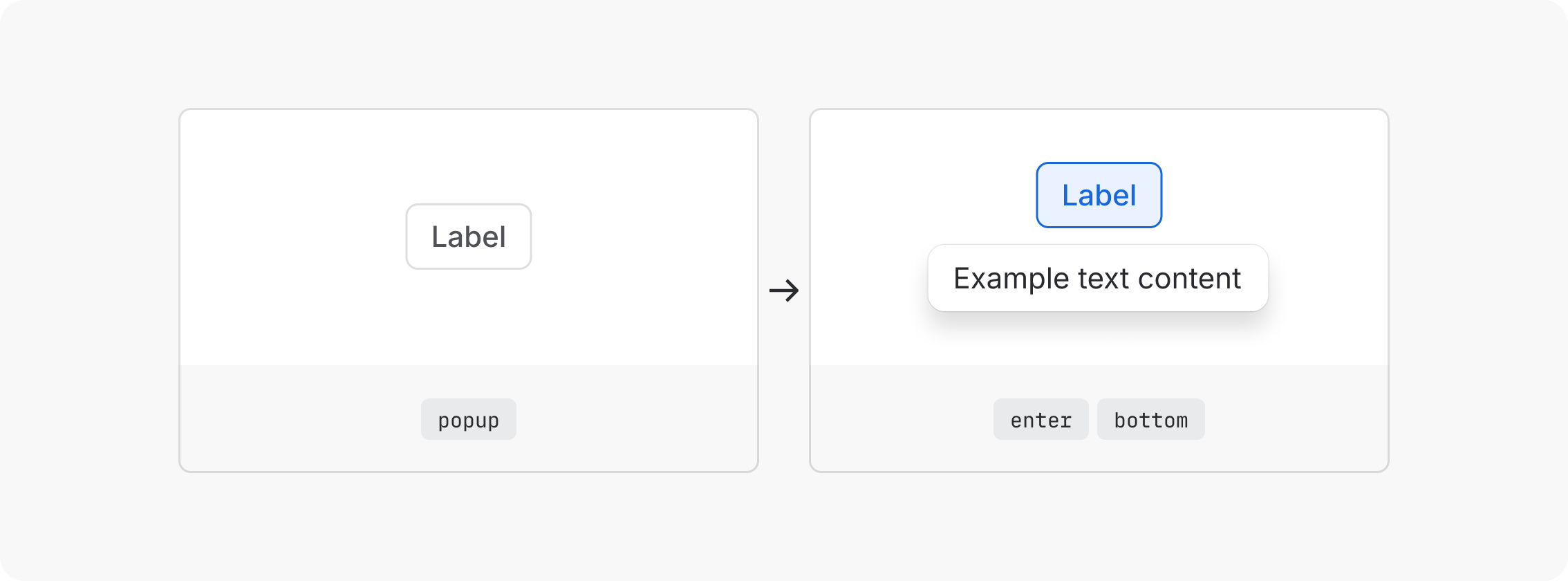
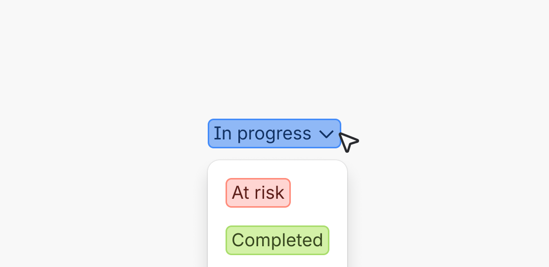
motion.popup.enter.top | Popup, Dropdown, Inline message |
motion.popup.enter.bottom | |
motion.popup.enter.left | |
motion.popup.enter.right | |
motion.popup.exit.top | |
motion.popup.exit.bottom | |
motion.popup.exit.left | |
motion.popup.exit.right | |
motion.spotlight.enter | Spotlight |
motion.spotlight.exit |
Composing custom motion
When making custom motion decisions, use durations, easing curves, and properties to build clear, human interactions that feel like Atlassian. Reach for semantic motion tokens first and check whether an existing token could work before composing something custom.
Interactions
Choosing duration
When interacting, users expect responsive, tactile results.
| Token | Value | Use for |
|---|---|---|
motion.duration.instant | 0ms | Instant feedback (e.g. focus state) |
motion.duration.xxshort | 50ms | High-frequency interactions (e.g. list item hover) |
motion.duration.xshort | 100ms | Subtle pressed states, quick exits |
motion.duration.short | 150ms | Interactive highlight (e.g. emphasised hover and pressed states) |
Choosing an easing curve
At interaction-scale durations, easing differences are subtle but still matter. Use practical curves as they provide natural deceleration without the dramatic character of bold curves.
Use motion.easing.out.practical (cubic-bezier(0.4, 1, 0.6, 1))
Animating different properties
Interactions should use the simplest properties that communicate the state change. At the interaction level, simplicity reads as speed.
Color
The most common interaction property. Used for hover backgrounds, selected states, and active indicators.
Fade
Useful for showing and hiding state changes.
| Token | Value | Use for |
|---|---|---|
motion.keyframe.fade.in | 0-100% | Hover reveal |
motion.keyframe.fade.out | 100-0% | Hover exit |
Transitions
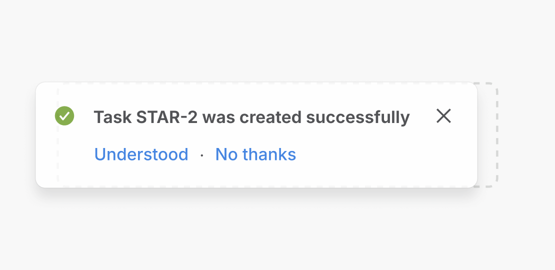
Entrances and exits
Entrances and exits are not symmetrical. Entrances orient the user to new content and establish context, while exits confirm a dismissal and clear the way for what's next.
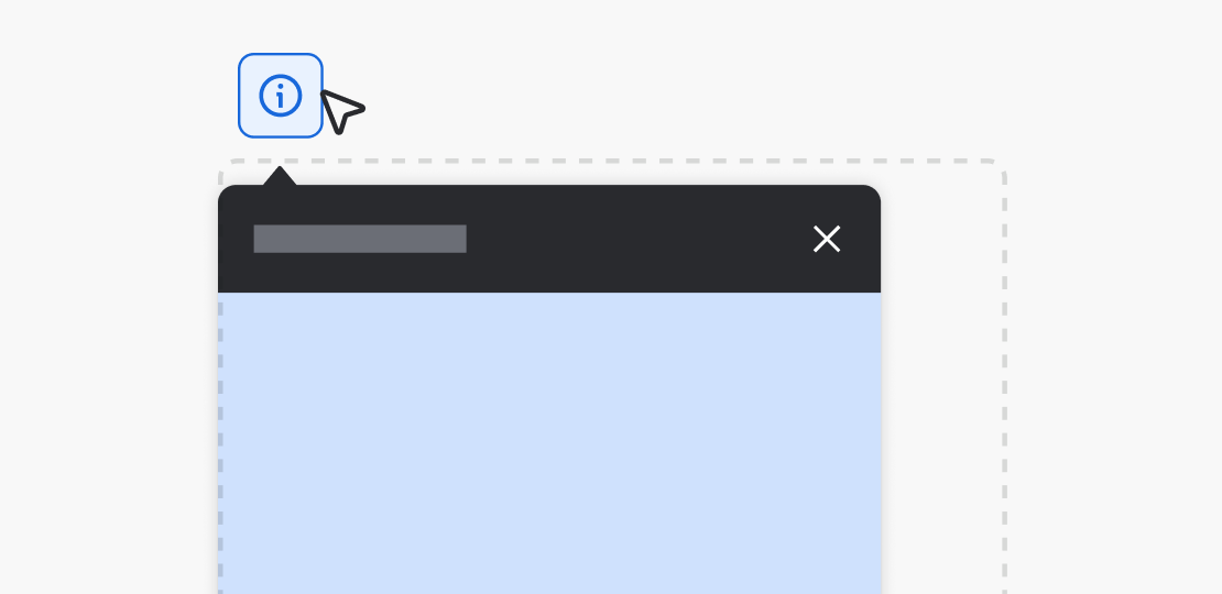
Do
Open and exit elements from where they belong. A Dropdown should open from its trigger, and a dismissed panel should exit in the direction it entered.
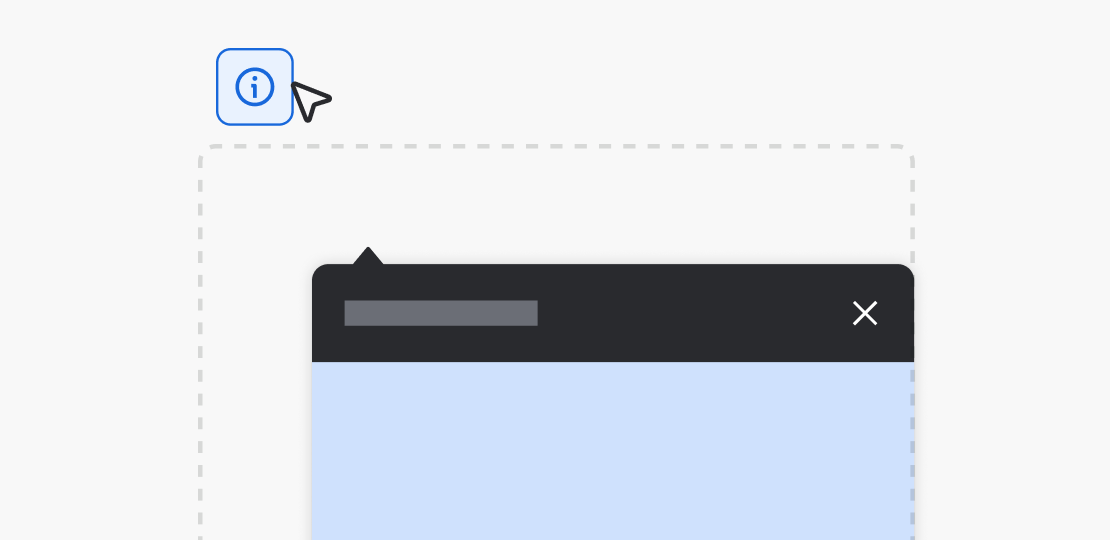
Don’t
Don't have elements appear or disappear from disconnected locations. It breaks the user's sense of where things came from.

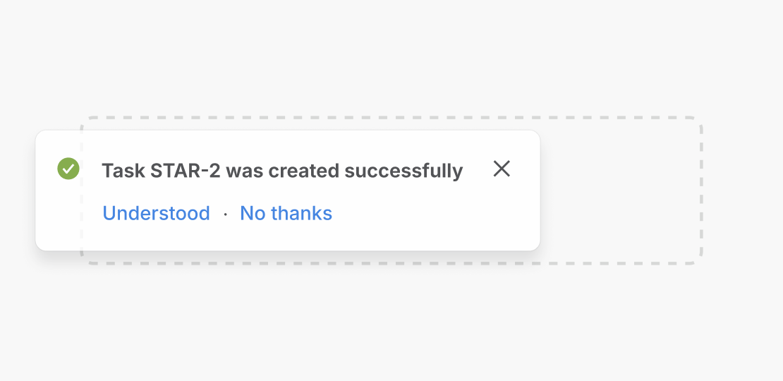
Do
Use the same entrance and exit pattern for similar components. Consistency helps users build a mental model and reduces cognitive load.

Don’t
Don't use different entrance or exit motion for components that play the same role. It forces users to relearn each interaction.
Entrances demand attention
Use a bold easing curve with a duration that gives the eye time to track the element.
Exits should be implied
Exits should be shorter, faster, and less dramatic. Use a practical easing curve and reduce the duration by 50ms or 100ms compared to the entrance.
| Component | Exit tokens | Entry tokens | Difference |
|---|---|---|---|
| Dropdown | motion.duration.shortmotion.easing.out.bold | motion.duration.xshortmotion.easing.in.practical | Entrance orients the user to options, exit follows their selection |
| Flag | motion.duration.longmotion.easing.out.bold | motion.duration.mediummotion.easing.in.practical | Needs to appear quickly and dismiss without lingering |
| Modal | motion.duration.longmotion.easing.inout.bold | motion.duration.mediummotion.easing.in.practical | Entrance establishes context, exit is a user-initiated dismissal |
Choosing duration
Duration should match the interaction's frequency and the element's visual weight.
| Token | Value | Use for |
|---|---|---|
motion.duration.xshort | 100ms | Subtle pressed states, quick exits (e.g. Popup exit) |
motion.duration.short | 150ms | Interactive emphasis, small entrances (e.g. Popup enter) |
motion.duration.medium | 200ms | Medium exit transitions (e.g. Modal exit, Flag exit) |
motion.duration.long | 250ms | Medium entrance transitions (e.g. Modal enter, Flag enter) |
motion.duration.xlong | 400ms | Large transitions (e.g. page-level transitions) |
motion.duration.xxlong | 600ms | Large transitions (e.g. onboarding steps, full-screen overlays) |
Do
Move focus and trigger screen-reader announcements at the start of the animation so assistive technology users aren't left behind.
Don’t
Don't land focus or announcements only after motion finishes. It creates a lag between visual and assistive feedback.

Do
Show errors, confirmations, and focus indicators without delay so users always know the system has responded.
Don’t
Don't gate critical feedback such as errors or focus states behind a slow entrance. It can leave users uncertain whether their action worked.
Choosing an easing curve
Easing gives motion feeling. Choose a curve that matches the element's intent.
| Token | Use for |
|---|---|
motion.easing.out.bold | Use (decelerate in) to grab attention with a fast start and controlled landing |
motion.easing.in.practical | Use (accelerate out) to get out of the user's way quickly |
motion.easing.inout.bold | Use for repositioning or scaling to maintain a sense of intentional energy |
As a general rule, entering elements use ease-out (decelerate in), exiting elements use ease-in
(accelerate out). For elements that transform in place, such as those that have transitions with
repositioning or scale, use ease-in-out.
Animating different properties
Different visual properties communicate different meanings. Choose the property that best reinforces function and context.
Fade
Appearing or disappearing without spatial movement (for example, tooltips, skeleton-to-content swaps).
| Token | Value | Use for |
|---|---|---|
motion.keyframe.fade.in | 0-100% | Element appearing (e.g. Tooltip) |
motion.keyframe.fade.out | 100-0% | Element disappearing (e.g. dismissed message) |
Slide
Directional entrance or exit (for example, Flag slide-in, Dropdown open).
Scale
Growing emphasis or shrinking dismissal (for example, Modal or Spotlight entrance).
| Token | Value | Use for |
|---|---|---|
motion.keyframe.scale.in.small | 95-100% | Modal or Spotlight entrance |
motion.keyframe.scale.out.small | 100-95% | Modal or Spotlight exit |
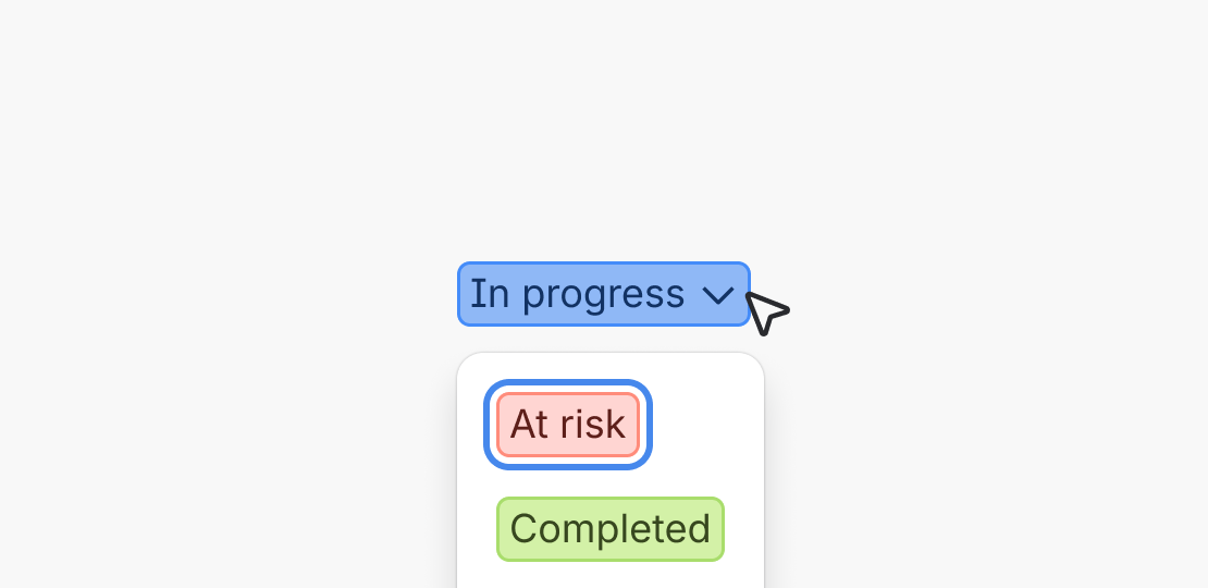
Color
State change or selection feedback (for example, lozenge change).
Combining properties
Combine properties sparingly. Typically, aim for one or two properties per transition.
Do
Fade and slide for directional transitions. Combining opacity with translation creates a clear spatial relationship, like a Flag sliding in or a Dropdown opening.
Don’t
Don't animate too many properties at once as it creates visual chaos. Stick to one or two properties per transition to maintain clarity.

Do
Animate transform and opacity. Use GPU-composited properties like transform and opacity so motion stays smooth on low-end devices.

Don’t
Don't animate layout-triggering properties. Avoid animating width, height, or top. They trigger layout work on every frame and cause stuttering on older hardware.
Tooling
Figma
Use Figma for simple flows and basic prototyping. ADS components do not yet support motion in Figma. Figma supports basic prototyping (flows, transitions), however, it does not yet support motion variables.
AI prototyping
Use AI prototyping tools to see representative component behavior, complex motion, multi-step interactions, performance checks, and custom behavior. Atlassians can use internal motion tools to experiment with token values, compare options, and validate behavior.
Experimental references
You can use north-star tokens as experimental references for your work. These are not official system tokens but represent explored guidelines.