Motion
Motion helps shape how users interact with apps to clarify interactions, guide attention, and express brand consistently.
Motion in Early Access
platform-dst-motion-uplift.Overview
When used with intention, motion helps users understand what changed, why it changed, and what to do next. Our motion system provides a shared language of semantic and base motion tokens so that every transition feels consistent, purposeful, and aligned with the Atlassian brand.
Motion principles
Our motion system is guided by four key principles that ensure every animation serves a functional and brand purpose.
Human
Motion reflects organic, human movement that is subtle, rhythmic, and intuitive. Experiences should feel warm and alive rather than mechanical.
Clarity
Motion is a clarifying layer, not decoration. It is applied consistently to guide attention and make experiences feel coherent and trustworthy.
Accessible
Motion aids comprehension without reducing comfort. Our system honors reduced-motion settings, providing clear low- or no-motion options.
Performant
Motion should be streamlined to reinforce a sense of speed and momentum. It should never add friction to how quickly teams get work done.
Fundamentals of motion
Every motion event is defined by three core attributes: duration, easing curve, and property.
Duration
Duration defines how long a motion event takes from start to finish.
Interactions (50–150ms)
Used for hover and press states. Short durations ensure the interface feels immediately responsive and polished.
Transitions (150–400ms)
Used for elements entering, exiting, or moving on screen (e.g. Modals, Panels). Longer durations help users track spatial changes. Larger elements generally require longer durations to feel proportional.
Dropdown entrance, 150ms
Modal entrance, 250ms
Easing curves
Easing curves control the acceleration and deceleration of motion, defining how a transition feels.
Ease-out bold
cubic-bezier(0, 0.4, 0, 1)Elements arrive quickly and decelerate to a stop. Best for elements like Panel or Flag entering the screen.Ease-in-out bold
cubic-bezier(0.4, 0, 0, 1)Gentle start and soft settle. Best for scaling Modals or repositioning elements.Ease-in practical
cubic-bezier(0.6, 0, 0.8, 0.6)Starts slowly and accelerates away. Best for exit transitions where elements get out of the way.Ease-out practical
cubic-bezier(0.4, 1, 0.6, 1)Subtle, everyday entrance curve. Best for elements like Popup or hover background fades.Motion properties
A motion property is the visual attribute that changes over time. Together with duration and easing, it defines how something moves or transforms on screen.
Scale
Growing or shrinking in size.Fade
Changing opacity.Slide
Moving along the X or Y axis.Color
Transitioning between background or border colors.Tokens
Motion semantic tokens are named bundles that encode context, motion type, and tempo. This allows designers and engineers to choose motion by intent rather than raw values. Use semantic tokens before reaching for base token options. For guidance on composing more customised motion, see Applying motion.
Token structure
A token like motion.popup.enter packages the specific implementation details: Duration + Easing
curve + Motion properties.
Best practices
Think about how motion layers across the UI. Core components should use motion for clarity, while branded experiences can use richer, more expressive motion for human touch.
Before choosing a specific token, evaluate motion through these four lenses. Each helps you decide if motion is necessary, how much is appropriate, and what risks to mitigate.
The individual element
Match motion to the element's function
Keep core UI components fast and subtle so motion reinforces state changes without competing for attention. Make feedback states slightly more expressive so the message lands clearly.
Align duration and expression to the element's size
Keep small elements (hover states, micro-interactions) fast and understated. Allow larger elements (like Panel or Modal entrances) more time and expression.
The broader experience
Maintain UI context
Use motion to direct attention to a new element, provide feedback from an action, or reinforce a brand moment during onboarding or loading. Before adding motion ask, if I remove this, does the user lose information or context?

Do
Check for workflow friction. Walk through the full user flow with motion enabled. If an animation supports the task, keep it. If not, shorten it through easing and duration.

Don’t
Don't make users wait without reason. Avoid motion that blocks the next step in a flow. If an animation makes the user wait without adding meaning, remove it.
Tone down motion for frequent experiences
Match motion expression to how often it is seen. High-frequency interactions like hover states, button presses, and list items should use minimal, near-instant transitions that stay out of the way. Reserve longer, more expressive motion for low-frequency moments like onboarding, first-run experiences, or milestone celebrations. If someone will trigger this motion dozens of times a day, keep it under 150ms. If they see it once a session, you have room for more expression.
Make experiences feel streamlined
Start motion immediately on interactions to avoid perceptible lags. Make exit motion faster than entrances so dismissed elements don't block someone's workflow. If motion makes the interface feel slower without helping users understand context, shorten it or remove it.

Do
Lead with one clear focal point. When multiple elements need to animate, simplify so a single event leads and others support it. A clear focal point keeps attention on the primary task.

Don’t
Don't run multiple simultaneous animations that pull attention in different directions. They make the interface feel busy and slow down the primary task.
Accessibility
Honor reduced motion needs and preferences
Respect reduced motion settings. Currently, when reduced motion is active, motion is off and instant. Never use motion that flashes, rapidly oscillates, or sweeps large areas of the screen. Verify the interface remains fully usable with all motion disabled.
How motion carries expression
Express brand moments with intention
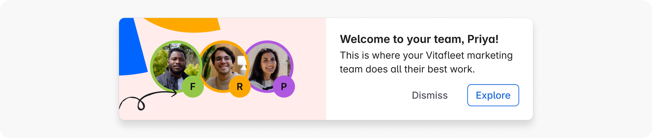
Keep motion warm, confident, and purposeful. Let it reflect the energy of teamwork without being distracting.
Save expressive, characterful motion for key brand moments, like onboarding experiences. Keep everyday UI motion efficient and focused, and let brand personality come through in restraint and polish rather than spectacle.