Design tokens are the new way to apply visual foundations in Atlassian product experiences. We’re rolling out tokens to standardize colors, elevations, spacing, and other styles in Atlassian products.
Design tokens are name and value pairings that represent small, repeatable design decisions. A token can be a color, font style, unit of white space, or even a motion animation designed for a specific need.
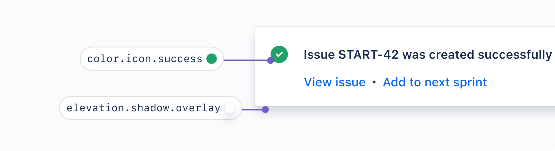
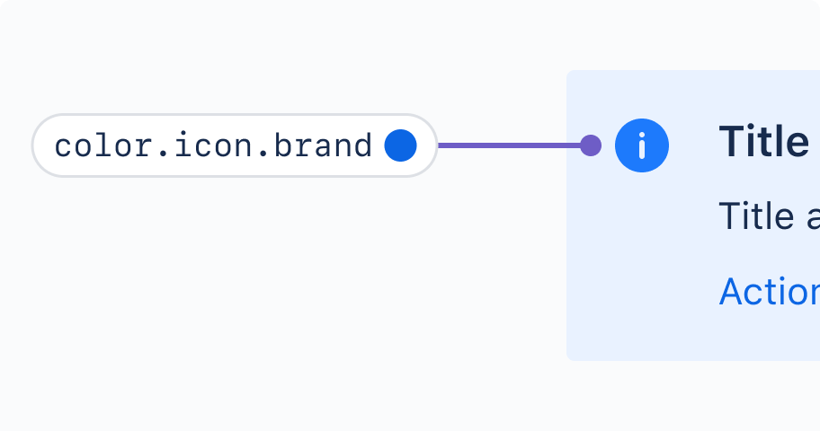
For example, instead of choosing one of many shades of green for an icon, we can apply a design token that is consistent with all similar usages across our products: color.icon.success.
A theme is a collection of token values designed to achieve a certain look or style. Themes are how we switch color schemes and styles everywhere using a single set of tokens.
Light mode, dark mode, and high-contrast mode are all examples of theming. Non-color themes are also possible: think cozy/comfortable/compact views, reduced motion, or custom typography styles.
Features like global theming (dark mode), responsive design, and user customization are possible with tokens.
Design tokens simplify the design and development by streamlining decision making and handover between crafts.
As Atlassian's visual language evolves, changes can be made once across the system and products. No more finding and replacing hard-coded values everywhere.
We have automated tooling to help designers and developers start using tokens faster.
Tokens are how we'll implement our newest visual foundations. This will deliver visual consistency and other improvements to Atlassian UI.
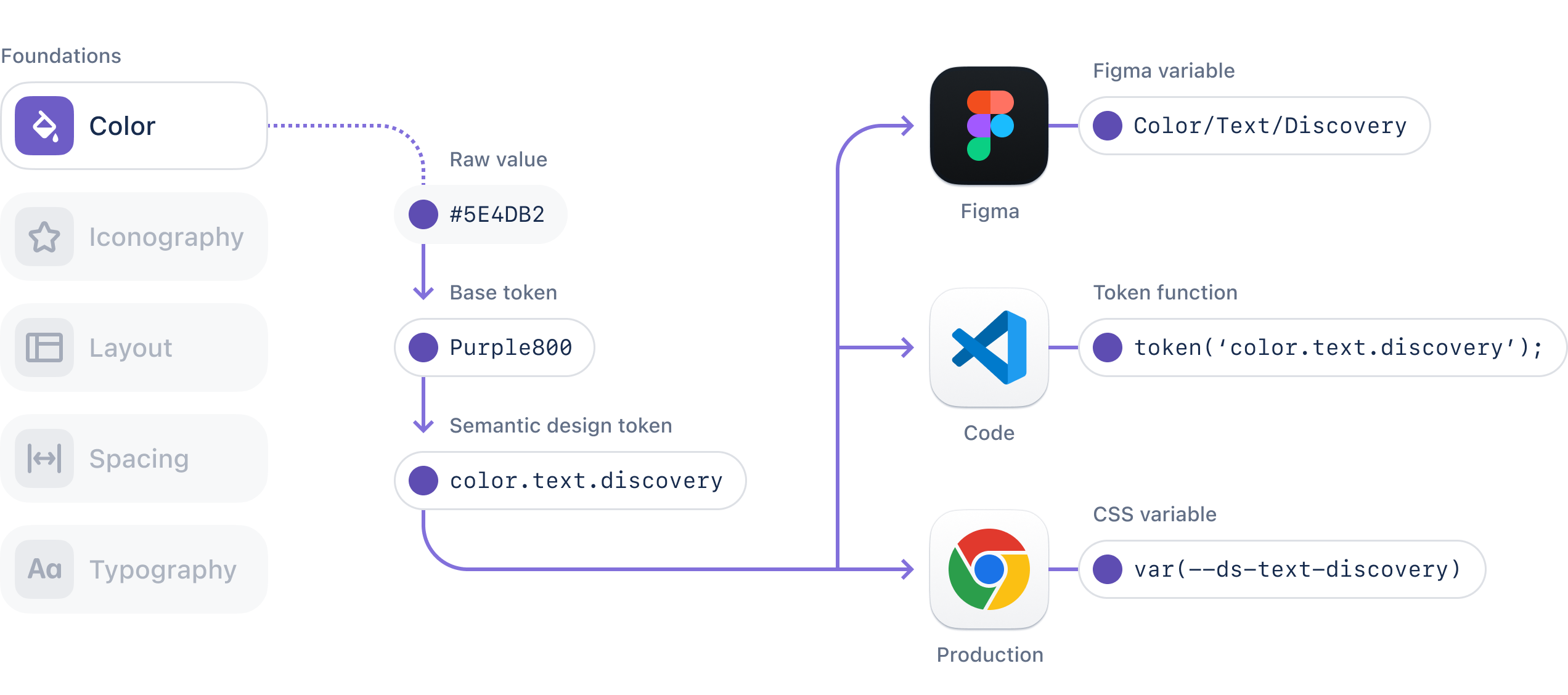
Knowing how to read token names will help you find the right token faster when working in designs and in code.

A design token’s name describes how it should be used, and each part communicates one piece of its usage.
Foundation: The type of visual design attribute or foundational style, such as color, elevation, or space.
Property: The UI element the token is being applied to, such as a border, background, shadow, or other property.
Modifier: Additional details about the token’s purpose, such as its color role, emphasis, or interaction state. Not every token has a modifier. For example,
color.textis our default body text color.
Note that token names might look different in different environments and tools:
Find all of our available design tokens and their usage descriptions in all tokens.
Search and filter the token list, or use our token picker for extra help.
Choose tokens based on meaning where applicable, not specific values.
Do
Use design tokens with names and descriptions that fit your specific situation.
Don’t
Don't use a token just because the colors appear to match. This can break the experience in other themes.
Check our foundations for color, elevation, and spacing for additional usage guidance.
Use these examples to get a better understanding of how different tokens work.
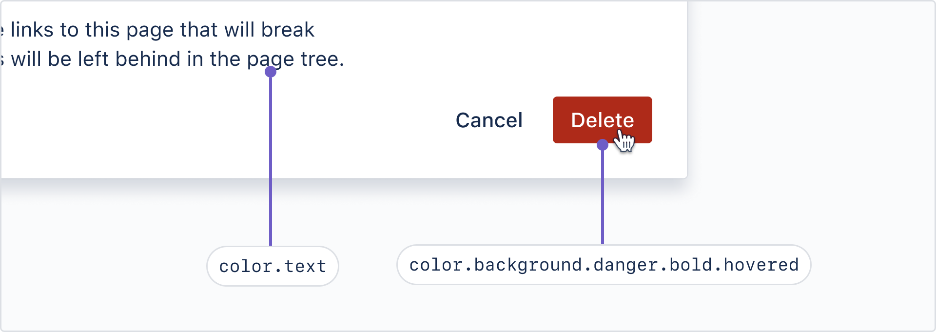
Here’s an example of color design tokens in use: the default text color and the background color for a "danger" button on hover.
There are dedicated color tokens for text, links, icons, backgrounds, borders, blankets, charts, and skeleton loaders.
For more on color token usage, see our color foundation.
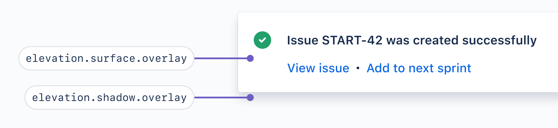
Elevation tokens apply to the perceived surface level and shadow.
For more on how and when to apply elevations, see our elevation foundation.
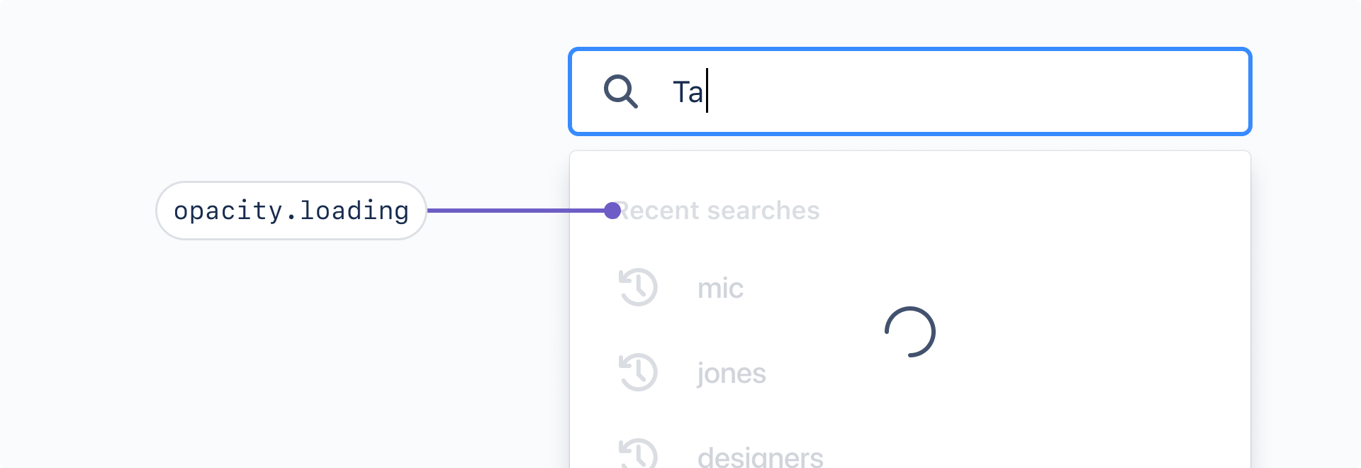
Opacity tokens apply transparency to an element. Use opacity.disabled for interactive images that are disabled (such as disabled avatar), and opacity.loading to content sitting underneath a loading spinner.
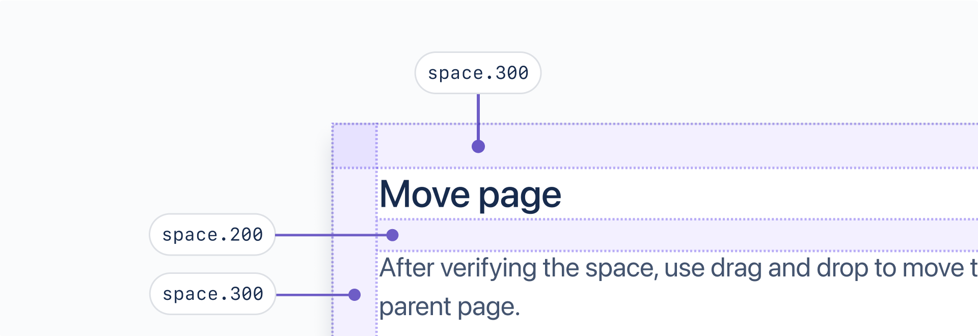
Space tokens reduce decision making and allow for consistent spacing between elements in a page layout. These tokens are designed to be use for horizontal and vertical spacing, in a variety of contexts.
For more on how our spacing system, and how to use space in your designs, see our spacing foundation.
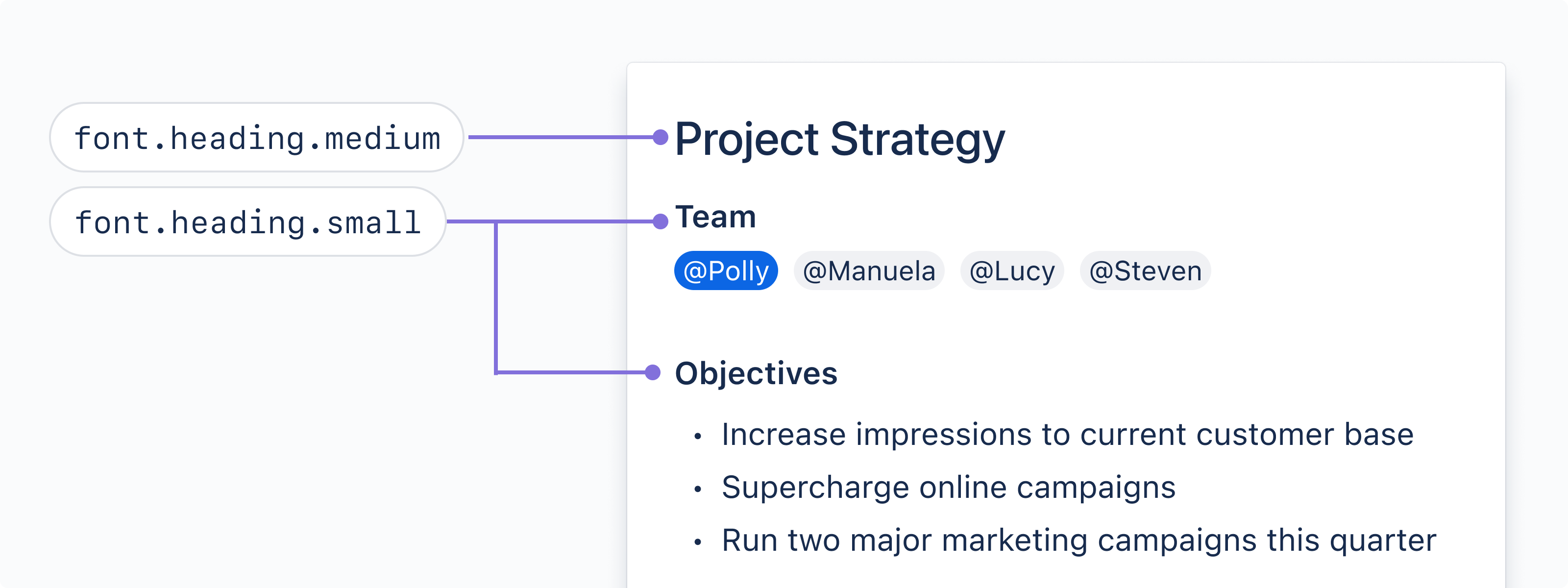
To visually align typography across Atlassian products, typography tokens include font values, including font family, font size, font weights, and line heights for all text styles.
For more on how to start working with typography tokens, see our typography foundation.
Learn how to Migrate to tokens
For additional component examples and code samples, see components examples.
Was this page helpful?
We use this feedback to improve our documentation.