Messages
Use messages to communicate conditions, indicate an event, or show responses to user actions.Message types include authentication, information, confirmation, warnings, and error messages. Identify the type of content the message falls under in order to choose the relevant color and icon.
Message types
Banners appear at the top of the screen and shift the content below it. They should only be used for critical system-level messaging (warnings and errors) about loss of data or functionality. Learn more about banners.
Inline dialogs
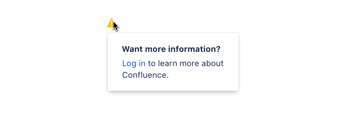
Inline dialogs consist of an icon and a message that's revealed when a user hovers over the icon. Use inline dialogs to alert people to a required action or important information. Learn more about inline dialogs.
Flags
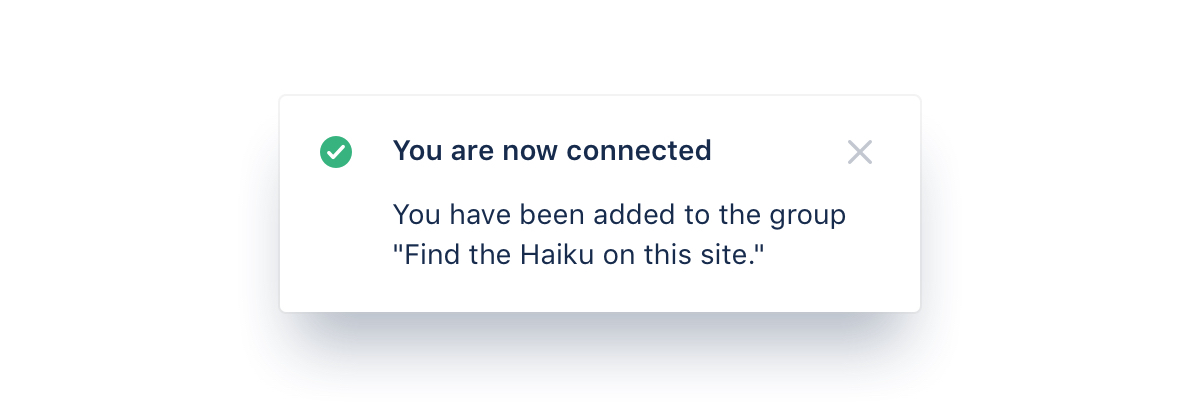
Flags are used for confirmations, alerts, and acknowledgments that require minimal user interaction. These event-driven messages appear by overlaying content at the bottom left of the screen, emerging from the navigation sidebar. Learn more about flags.
Section messages
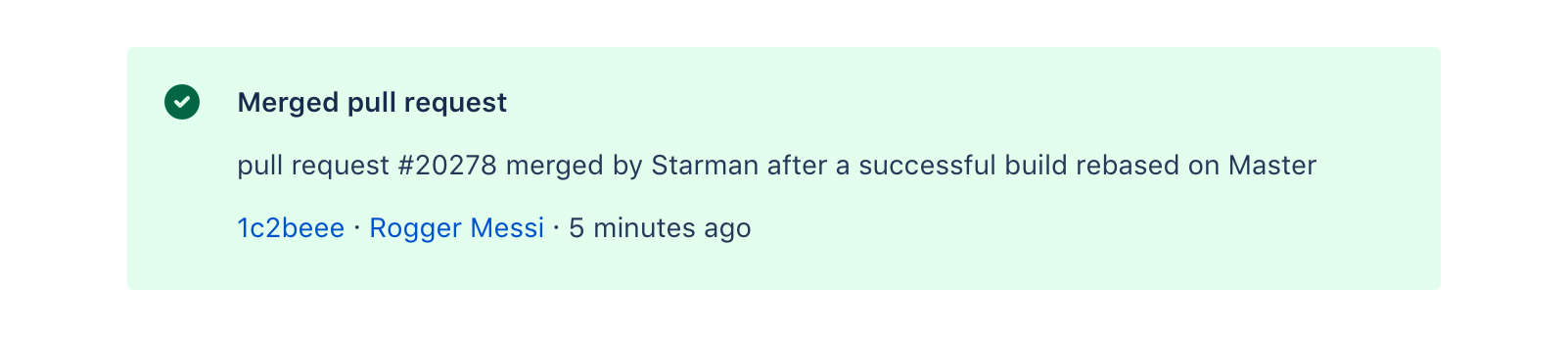
Section messages are used to alert the user of something that has happened in a specific section of the screen. They appear above the affected area (for example, work items in Jira). Learn more about section messages.
Colors
Message types use colors and icons to help indicate content and urgency. The available message types are information, success, warning, danger (error), and discovery (new).
Setting the right color and icon for a message ensures people understand the nature of the message at a glance, and that they take appropriate action.
Make sure you use the right color role for your situation. For example, yellow typically implies warning, while green can imply success. See our color guideline for all color roles.
Icons
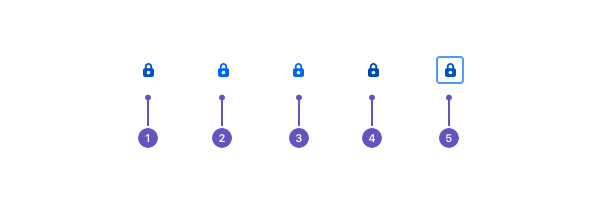
The appearance of icons changes depending on the current state. This visual indicator makes it easier for people to interpret the message.
Resting
Hover
Selected
Active
Focus