Typography system reaches General Availability (GA)
The Atlassian Design System (ADS) has shifted to using the new typography system.The Atlassian Design System’s typography system launched in beta in Q3 FY25 and we are excited to announce we are officially now in General Availability (GA). This will improve accessibility, readability, and harmony across apps.
Modernized and Legacy typography systems are now deprecated, but will be supported until Jan 2026 to allow for migrations.
All apps are expected to adopt our new typography system using Atlassian Sans and Mono. To make this process easier, we have enabled the new typography by default in our libraries.
What's new in GA
Since the beta launch, we have focused on refining and enhancing our typography system based on feedback and testing. These improvements are now available in the General Availability release.
Here are the key updates to our typography system:
Improved legibility through character refinement
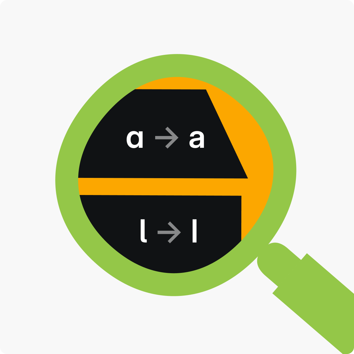
Based on legibility testing and user feedback during the beta phase, we have revised the design of the lowercase ‘a’ and ‘l’ to enhance readability.
We’ve also added true, designed italics styles for both Atlassian Sans and Mono, improving the readability and aesthetic quality of italicized text.
Introduction of metric text token and component
New metric text styles and a component have been implemented to provide a structured and consistent approach to managing typography across projects.
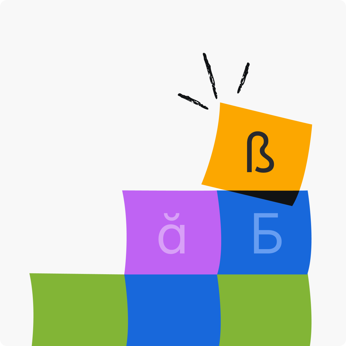
Added language support for Greek
Support for the Greek language has been added to both Atlassian Sans and Atlassian Mono, improving how Greek characters are displayed alongside English and other languages.
Changes improve legibility, accessibility, and consistency
The new typography system improves legibility, accessibility and consistency across apps. Here are some of the specifics of how we got here.
Improved legibility
Feedback from makers and end users revealed legibility issues with the newly-refreshed typography launched in beta, especially in long-form content.
Legibility testing was conducted around letterforms, letter spacing, letter sizing and text contrast.
Results indicated a preference for specific character forms, particularly the double-story 'a' and 'l' without a tail, which improved readability. As a result of this testing, the typography system has been updated to include these enhancements.
Better consistency and accessibility
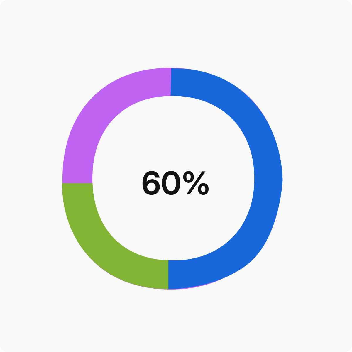
A new metric style for displaying numbers in data visualizations has been introduced, available in three sizes (small, medium, large).
This change addresses previous accessibility issues where makers used headings to highlight key numeric information. This disrupted the page hierarchy for users of assistive technologies like screen readers.
The new style provides a semantically appropriate way to present numbers, improving the communication of data and analytics across apps, and enhancing accessibility.