Forms are used to get information and guide people with minimal fuss. Designing forms well requires making decisions about structure, sequence, interface elements, field labels, help, and feedback.
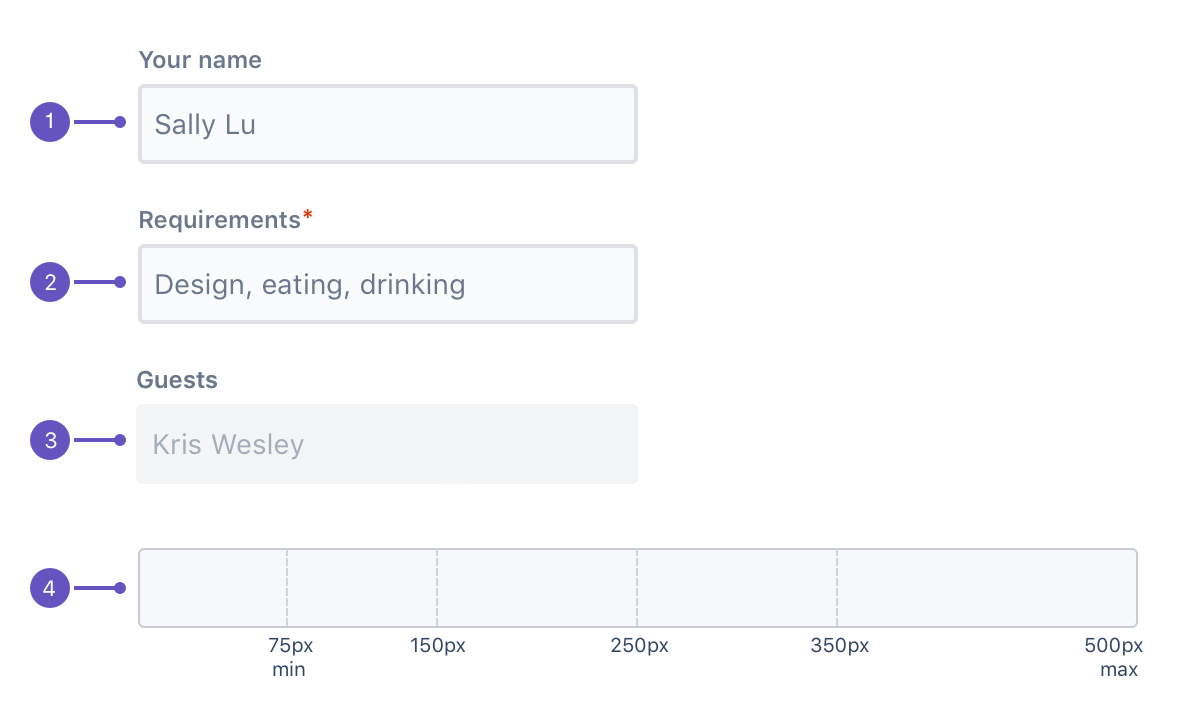
Labels: Standard label alignment is left-aligned with the field underneath. For the placeholder text, use sentence case and left-align.
Required field label: Mark required fields with an asterisk (*). If all fields in the form are mandatory, this isn't necessary.
Disabled fields: Show disabled fields if users need to know what controls might be available to them.
Field length: The length of the field should reflect the intended length of content. Available lengths are 75px, 150px, 250px, 350px, and 500px.
Style
Accessibility
Autofocus the first field by default. This allows users to tab through elements in the form in a logical way.
Never disable a submit button, even if all of the required fields aren't filled in. Instead, describe what needs to be done using validation and error messages.
Layout
Common form components include text fields, checkboxes, radio buttons, selects, date pickers, toggles, and buttons.
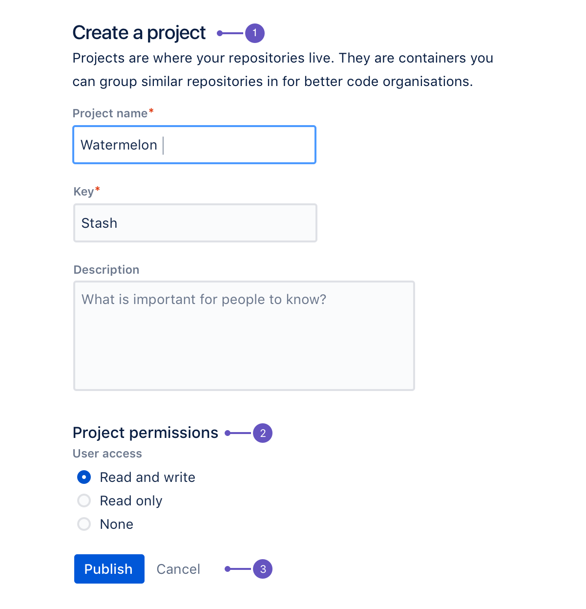
Title: Describes the form. If the form is the main item on a page, use an h2 tag, otherwise use h3 and adjust the rest of the page hierarchy accordingly. Follow the title with a short description.
Group headline: Describes a group of controls and fields within a form. These should be grouped to help users understand what is required of them in a logical way. Try to make the headline concise and informative, but, if you need to, you can add a short paragraph of text to explain the group.
Buttons: Use a primary button for the main action, and a link button to cancel. The primary button should be left-aligned along with the left side of the form field. If additional actions are required, put the primary button first, then any standard buttons, then the link button. The only exception is a multi-step form where the 'Back' standard button sits at the very left, while the rest of the buttons are aligned to the left.
Buttons are sorted by importance from right to left, with the most important button (primary) on the right.


Exceptions to this are single-page forms, flags, cards and section messages where buttons are left aligned; with the primary button on the left.

Long forms
When users access a form, it can be daunting to be shown a large number of fields that need to be filled out. The threshold for when a form is considered too long depends on the audience and the context. There are various techniques for lessening the impact of long forms.
Multi-step forms
Make sure people know their status at each step of a form. This approach can be used to spread form fields across more than one screen with a progress tracker. When using this pattern, each screen should show fields that logically belong together. This pattern is also good for saving form progress along the way.
Progressive disclosure
A form can reveal more content as users go through the form and use its fields and controls. This technique can be used when it is not necessary to see all controls unless users have made specific decisions, for example, if they ticked a particular checkbox additional information would be revealed.
Behavior
Validation and error messages
Use validation and error messages to indicate when a form or field submission fails or requires additional information to be shown.
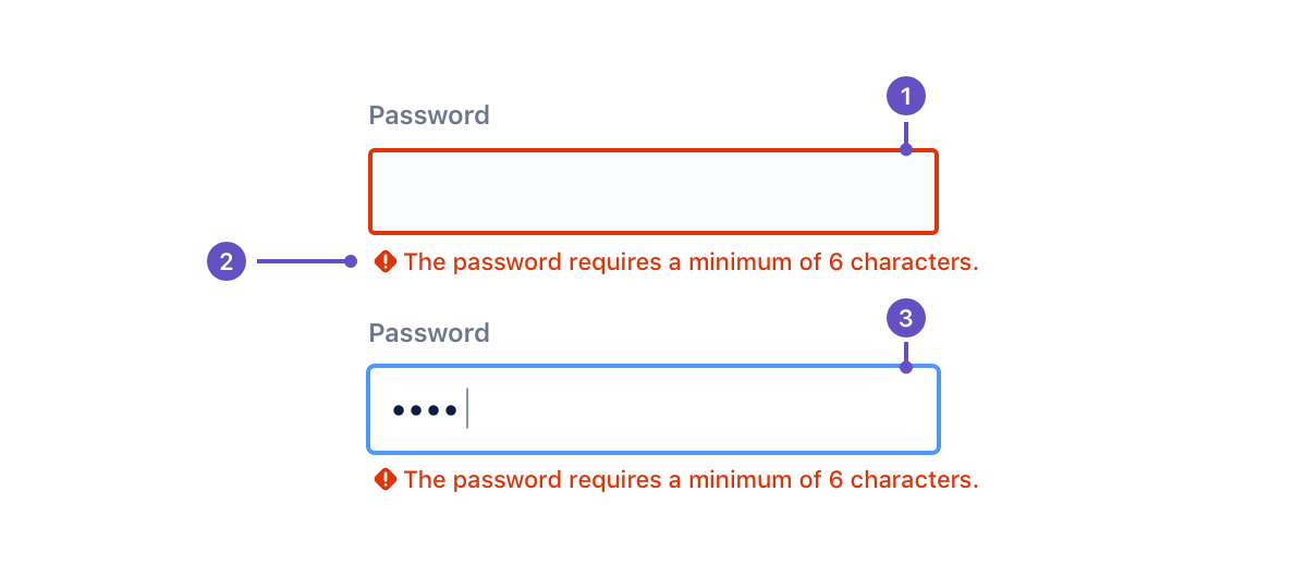
Unfocused text field
Error message and icon
Focused text field
When a user selects the text field and starts typing or changing content, the focus color changes to blue.
When validating text fields in real-time, message icons will switch depending on the message type. For example, helper text changes into an error message when the content being input doesn't fit the criteria. Error and warning messages disappear when the criteria is met.
Server
Primary buttons are left adjusted in AUI forms.