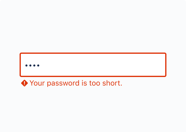
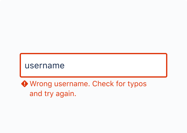
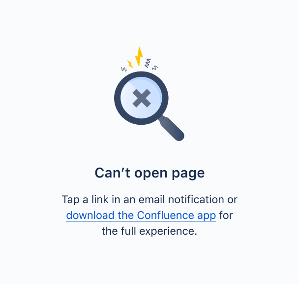
An error message, different from a warning message, appears after someone has taken an action. The message draws their attention to what has happened and what the consequences are, and what people need to do to move forward. Optionally, they can also include why something happened and whether the problem will occur again.
When crafting an error message, remember that most people scan text instead of reading everything. Make every word count and avoid irrelevant details.
Writing best practices
Titles are optional depending on the component you choose.
Include an informative, scannable title. Try and imagine people trying to understand what’s happening by reading the title on its own.
Avoid explaining what to do.
Limit titles to three to four words where possible, excluding “an”, “a”, or “the”. The character count will depend on the component you choose.
Write in sentence case with appropriate punctuation.
Include: the reason for the error and the problem, how someone should act and what happens if they don’t act.
If you don’t know the reason for an error, don’t make one up – just say that something’s gone wrong and offer a solution for what people can do.
Avoid repeating content from the title.
Keep messages to 1 to 2 sentences.
Avoid putting technical information in the message or having people look in another location. If it can't be avoided, use a link to support content.

Do

Don’t
When an error message invokes a choice, use imperative verbs such as “Save”, “Remove” or “Create”, in the CTA to describe what action people will be making instead of vague terms such as “OK”.
An option to dismiss or cancel lets people feel reassured that they can opt out.
Limit your CTA to 1 or 2 words.
Voice and tone
Errors are high-stakes situations. They can be frustrating at a minimum, or catastrophic at their worst – especially when they involve work.
You want to leave people feeling supported and reassured. Convey an error message with empathy and tact. The correct level of urgency will let people understand how to respond. Follow some of the following Atlassian voice and tone principles to build your message:
Be open and clear about what people are experiencing in our products. Be aware that your reader could be new or confused, and tone down the boldness by being more prescriptive.

Do

Don’t
Treat errors as an opportunity to educate people. Help them understand why they’re experiencing something and how they can avoid similar issues in the future. You may even be able to teach them something that can help them understand and manage the technology they use beyond our immediate products.
Be consistent and dependable. Avoid messaging that focuses on the problem without offering a solution or way forward. Focus on next steps where possible and stay away from negative words or phrases.

Do

Don’t
Use we instead of you, as emphasizing the relationship between the person and the problem could make them feel like they’re being held responsible.
Provide quick and thorough answers, guidance, actions, and instructions. Give them the information they need then get out of their way.

Do

Don’t
Avoid using “please” and “sorry”. Saying "sorry" in error messages can make the situation worse by causing errors to appear more severe than they actually are. Similarly, saying "please" can undermine the authority and credibility of your message and lead people to think a required step is optional. Unless the error has severe and irreparable consequences, avoid niceties.
If the error has more than one potential cause or solution, try one of the following writing strategies.
An error message alerts people of a problem that has already occurred. By contrast, a warning message alerts people of a condition that might cause a problem in the future.
Use text, design elements, and visual clues to differentiate the difference between where people are in their journeys.
Stick to the most likely cause or the simplest solution in the first sentence of the error message and offer an alternative backup solution in the second sentence in case the error keeps occurring (for example, contacting support). Try to reframe the error as an opportunity to inspire trust and confidence.

Do

Don’t
For dead ends, start with something short but kind, and add context or other details only if the error will reoccur.
Use error messages in the following components:
Use alternative text for illustrations and symbols in your messages
Avoid jargon and use simple language
Make links as descriptive as possible
Make text easily scannable to highlight key information.